Pages

Showing posts with label Ben 10. Show all posts

Monday, August 3, 2015

Wednesday, May 22, 2013

120 [m ] - Back and Force

 Conceptual compositions for promotional posters for the launch of Ben 10 Alien Force.
2008.

 Conceptual compositions for promotional posters for consumer print advertisments of Ben 10 Alien Force.
2008.

Conceptual compositions for promotional “tease” posters for the launch of Ben 10 Alien Force.
2008.

Back in 2008, Cartoon Network had in production Ben 10 Alien Force, a spin-off series of its successful Ben 10 animated actioner. In it, Ben was five years older, and teamed up with his cousin, Gwen and former adversary Kevin Levin. In true sequel fashion, so much of it borrowed from its predecessor: a) a basic logo design; b) “kid with a magic watch” set up; c) alien heroes; and d) green.

Thematically, the series was darker and even took place mostly at night. However, the key impression we attempted to communicated was “different” while retaining all the audience’s favortie parts.

Series producer, Glen Murakami, offered some suggestions for poster images in the form of his inspirations for the new series. And then I drew. As an experiment, I tried sketching natively in Photoshop with the Wacom Cintiq digitzing display. A practice helpful when I was experimenting with  resizing and re-positioning elements like logos and iconic images of Ben.

The teaser poster, resembled one of the concept sketches - well, if not for any other reason than we locked the shadowed Ben pose at the start, because it was a pose already being produced for licensing. The consumer print ad turned out pretty faithful to the layout of the first sample on the left of the second row.

I’ll note additionally, that I always seem to throw in tilted layout options for action show posters, and some where in produciton someone straightens them out.


> sigh <
BEN 10 ALIEN FORCE TM and © Cartoon Network.

Tuesday, November 6, 2012

Cartoon Network’s 20th Birthday - Extra

TUFF-GIRL vs. ED BENEDICT


Ed Benedict was an animator and layout artist who, in his work for Hanna-Barbera Studios, helped design many of its early television series including The Flintstones.

Character design and animation of this period had almost everything to do with economy, or in other words solutions to limited television budgets. As result you have a lot of characters who stand and talk, characters in lengthy walk cycles and running cycles (against repeating backgrounds) also usually talking, and characters with convenient accessories of collars and neckties that clearly define the body and a talking head.

This design is a caricature of anatomy and not very reliant upon a working skeletal structure. Peculiar to The Flintstones, for example, are Wilma’s and Betty’s skirts which operated more like puffs of fur from which their legs may protrude in any direction without, for the most part, disturbing the puff’s shape.


A large part of the joy of drawing The Flintstones are not only the fanciful dinosaurs but even more fanciful low-tech gadgets. How is it possible to cobble together a motor bike using stone wheels, logs, a tortoise shell and bee hive? If only real engineering were as easy and fun.

In the concept sketches, I tried giving Wichita a saber-tooth look which only complicated the fuzzy muzzle I wanted to keep in the design. The layout on the whole is not, admittedly, consistent with the original Flintstones series in which all action takes place parallel to the screen, left, right, up and down. Fred always made U-turns off screen. The change from a running dinosaur was to better fit it in frame without worrying about its tail, and benefitted from having a more interesting twist in its posture and its head popping out over the hill in groundhog fashion is a better visual than merely a hungry dino.

[final color art]


TUFF-GIRL vs. CRAIG McCRACKEN


 A lot of the designs of The Powerpuff Girls (PPG) were co-developed by both Craig and Genndy Tartakovsky (Dexter’s Laboratory). With both having worked at Hanna-Barbera on Two Stupid Dogs, it’s not surprising that both their first shows, PPG and Dexter’s Lab, carry on the H&B style. I describe much of the style as a theory of letting shapes be interesting first and descriptive or representative second. So there are irregular zig-zagging lines which could be a row of teeth, fingers or a torn shirt and loopy curls which could be puffs of hair, a tree canopy or a bunch of flowers.

It’s possible that from his work on Batman, The Animated Series, Genndy imbued strong lines of action to character designs, often as unbroken arcing lines on one side of an arm or leg.


As a pre-wide-screen series, rarely did PPG have more than three characters in an action scene, and as such, this layout is too busy as a faithful show set-up. This is really two scene squeezed together. Although I’d like the focus up front, but it’s kind of better to flatten the space to have Tuff-Girl more fighting along side all three Powerpuff Girls.

My first concept sketch is a post-battle, victory scene. This is what I do when I haven’t figured out what the characters look like. Once I’ve a design (and in a sense am bored with it), then more interesting poses come out as an expression of “I wonder what else this character can do?”

My Dexter’s Lab styled Tuff-Girl and Wichita would probably be the same as this. And I probably change little for a Foster’s Home for Imaginary Friends style, also a show by Craig.

[final color art]


TUFF-GIRL vs. MAN OF ACTION


Ben 10 was created by a group by the name of Man of Action (Duncan Rouleau, Joe Casey, Joe Kelly and Steven T. Seagle). Although drawing upon stylistic influences of comic books and Japanese Anime, much of what ended up on screen became less stylized, more rounded and generally having less of a distinct style. This then became my biggest struggle – what does a Ben 10 styled Tuff-Girl look like? My solution mostly relies on a bigger head and an Omnitrix hour-glass motif worked into her costume.


My choice to draw Diamondhead as Ben’s alien-hero transformation did come from his sharp, crystal edges being a reasonable contrast to Tar Bear’s sloppiness. It is also a reflection of how much more comfortable I am now drawing him than seven years ago. Diamondhead was mostly designed to be seen in certain angles that allows his brow/ visor to naturally form a “V” for an intense gaze. There are other little details of his design that don’t work in three-dimension, so half about Diamondhead is figuring out a cheat for a better, stronger pose.

I like having Tuff-Girl (and Wichita) chasing Dr. Animo. Story-wise, once T.G. catches Animo the fights over and the action’s done and that’s not what you want on your comic book cover. Having decided to change the layout to have T.G. in the foreground, Animo still had to be in the fight.

[final color art]


TUFF-GIRL vs. PENDLETON WARD


Pendleton Ward created Adventure Time. Although he worked as a storyboard artist on The Marvelous Misadventures of Flapjack, there is perhaps no one source of stylistic influence for the show’s design.


For sure there are a lot of small button eyes, big round heads, rubber-hose arms and legs, small 3-fingered hand and a general absence of noses. Although none of these are shared by Tuff-Girl’s traditional design, it’s perhaps due to these that so much fell into place quickly. A lot of stylized Tuff-Girl draws upon the Fionna character design as opposed to series regulars like Princess Bubblegum or Marceline the Vampire. Stylized Wichita is somewhat based on a wolf cub that appeared in an episode. Stylized Eagle One could be based on any of the rugged warriors that pop up in the series.

The back story also seemed to fall in place quickly. As the last of the four scenes I was creating for this celebration, the victory moment also seemed appropriate.

[final color art]


TUFF-GIRL vs. IWAO TAKAMOTO


Iwao Takamoto was a Japanese-American Animator who was a production and character designer for Walt Disney Productions and for Hanna-Barbera design characters for such shows as Scooby-Doo.

My exploration here is a slightly shorter Daphne in a simplified Tuff-Girl costume. Given how this basic girl design served as the house-style over many years, there wasn’t any reason to push it further.

Wichita is her same silhouette with Scooby eyes.


TUFF-GIRL vs. GLEN MURAKAMI

Glen Murakami is an animator, animation director and producer known for his work on Batman Beyond, Teen Titans and the Ben 10 series Alien Force and Ultimate Alien.

My exploration keys in on Murakami’s signature style of strong posing and lines and sharp definitive corners. A finer tip pen would have helped. Her costume has much larger areas of black than I usually design just to take advantage of Glen’s sense of using strong black shapes in his designs.

Wichita’s design is almost all made up as his designs for terrestrial, four-legged creatures is rare, especially small, furry ones. 

Saturday, October 27, 2012

Cartoon Network’s 20th Birthday - part 3 of 4

What would it look like if Tuff-Girl and Wichita teamed up with alien-transforming Ben Tennison against their arch rivals The Tar Bear and Dr. Animo?

“Omni-Team”
Digital color over cleaned scan of India Ink
I consider the first half of Cartoon Network’s second decade (2002-2007) the years that the network tried stuff.

By the numbers (which may be as misleading as they might be instructive), CN premiered 16 produced or co-produced cartoon series, more than its first five years (naturally), second five years or most recent five years (4, 9, 14). This period was also busy with seven shows that were still in production from the previous decade. With hits like Codename: Kids Next Door, Foster’s Home for Imaginary Friends and Ben 10 and popular shows like The Grim Adventures of Billy and Mandy and Chowder this period had a respectable average show life of 2.6 years for it’s new shows, although not quite as healthy as the 3.6 years average for the prior five year period.

While the first decade drew heavily on the legacy of Warner Brothers’s and Hanna-Barbera cartoons, these five years has the Network seemingly trying to dial in on a winning formula. First identified by a colleague, the most repeated set-up popping up in these five years is the “boy and his best thing friend” show. For example, Foster’s Home for Imaginary Friends featured a young boy (Mac) and his imaginary friend (Blooregard). My Gym Partner’s a Monkey had Adam and Jake Spidermonkey. Squirrel Boy had Andy and Rodney the squirrel. Even “Billy and Mandy” is a little like that too.

Before the its 15th birthday, the Network showed that it was also willing to extend beyond the limits inherent of having a such a clearly and narrowly self-defining name of “Cartoon Network” by trying its hand with a live-action/ animation hybrid show, Out of Jimmy’s Head.


Here I drop Tuff-Girl and Wichita in the middle of the Network’s only second action show, Ben 10 (Samurai Jack being its first). With my choice of Ben’s many alien hero transformations, I thought Diamondhead’s sharp edge, crystal forming abilities would contrast well with The Terrible Tar Bear’s slop slinging. Dr. Animo then becomes a natural addition as the nefarious force that takes control of The Tar Bear’s mind, and perhaps imposes mutant changes on the goopy bruin.

I have worked as a staff illustrator for Cartoon Network since 2001.

Sunday, April 29, 2012

120 [m ] : Ben 10: Ultimate Alien Launch Billboard

2010 - Another Ben 10 series, another launch campaign. This time Ben goes ultimate, or more precisely, some of Ben’s alien hero transformations from the previous series, Alien Force, go ultimate.

At the conceptual stage, I think Matt, Clint and I pitched some of the more diverse selection of visuals since the original series (above). This is probably because we were consciously avoiding any thing that looked like a Ben 10 poster or DVD package used by Cartoon Network (CN) prior to this point.


And the winning design to advance to the rough layout stage - features heroic Ben, popular alien, Humungousaur, and new variant alien, Ultimate Humungousaur (above). Stated like that, it sounds like we just fulfilled a marketing wish list.

The final digital painting was done out of house by artist Phillip Hom, under my art direction.


Presented here (above) is the “final” version of the poster - straightened out, cropped wider and green cosmic flames added around the figures. In animation, the green flames expand out from the chest Omnitrix badge on Humungousaur in Bonanza fashion to reveal his ultimate incarnation. Without animation, you wouldn’t know what it has to do with the show or its characters. The lesson here is, “hey, you artist working for a company, this is not your art.” The final poster was displayed outside the Atlanta Turner buildings facing 10th Street, had limited internal CN distribution as a poster, and served as the visual basis for all launch materials including on-air and on-line.

Saturday, April 28, 2012

120 [m ] : Ben 10, Alien Swarm Central Image

2009 - Alien Swarm, as mentioned previously, was an original live action movie featuring the main trio of characters, Ben, Gwen and Kevin, from the Cartoon Network (CN) animated series Ben 10: Alien Force. Especially because it was a movie, although CN does tend to pattern big marketing campaigns as movie premieres, we were to develop a movie poster to deliver all the iconic elements of the program. This was quickly, albeit informally, known as the central image.


The creative team of Matt, Clint and myself (if memory serves) largely were inspired by the current tropes of an action movie movie poster: 1) ample use of black; 2) saturated key colors (green for all Ben 10 iterations); 3) big faces of the main actor*; and 4) vignettes of key action sequences, villains or mystery characters**. Above are the little conceptual thumbnail drawings I produced on our initial brainstorming session, which mostly served as a guide for poses and camera angles which could possibly be of use from a photo-shoot of the four young actors.

Here’s what I feel needs clarification:
* Big faces of the main actor/actress is only of value if the target audience is expected to recognize the actor/actress. That seems like basic marketing to me. Alien Swarm cast all young unknowns for the main cast. But big faces being so much a part of “action movie” poster vocabulary, it was hard not to deliver some as conceptual explorations.
** Mystery characters- to show them or not to show them? Elena, the mystery character in “Alien Swarm” had nothing to offer as a visual element to the poster, because she was not part of “Ben 10” mythology. She was only given a back story to connect her to Ben - so once after audience figures out who the other three teens are they are left to wonder if the second girl is maybe Ben’s girl friend, Julie, with re-cast ethnicity. Mostly, the mystery of Elena is whether or not she is on Ben’s side, and that kind of ambiguity does not read well in a poster visual.

As always with Ben, it’s his wristwatch, the Omnitrix, that gives him the power to jump into action. It isn’t Ben that punches and shoots things, it’s any number of alien heroes in which he’s transformed that punches and shoots things.

There was the additional complication that the visual effects company would not be able to fulfill any special request for images of Ben’s alien hero transformations.

Wednesday, April 25, 2012

120 [m ] : Ben 10: Alien Swarm for Action Pack

2009 - Ben 10 continues to be successful and Cartoon Network (CN) creates the franchise’s second live action movie, Ben 10: Alien Swarm. In it Elena is introduced as 15 year old Ben’s friend from his childhood (no she not a character that appeared in the original series). DC Comics’s CN tie-in comic magazine Action Pack was to include a story with the “untold” story of how Ben first met Elena.

Elena, 10 yr., with expressions.

 
Elena and Ben, compositions.

I don’t know how such things come to be, but our group of Atlanta based illustrators was approached to design Elena for the comic, even though we would not do the actual comic illustrations.

 Elena, 15 yr.

120 [m ] : FusionFall Print Ad

2008 - Cartoon Network’s (CN) on-line group (a.k.a. new media, a.k.a. digital) created a M.M.O.G. (Massively Multiplayer Online Game) called FusionFall. It’s kind of like “World of Warcraft” and Disney’s “Kingdom Hearts” series of games, but with CN characters and environments.

Two-page spread print ad.

This was a rare print ad buy (literally a bought advertisement) for the game. In typical process, I devised this piece of conceptual composition (a.k.a. “comp”) with characters available to us - characters which were built built in 3-D for on-air commercial ads as opposed to the simpler characters created for the actual game. Working with Matt, we built on the idea that it’s good guys versus bad guys and not at all addressing that players create avatars and aren’t playing as or controlling CN characters.

To the left, FusionFall versions of Ben (Ben 10: Alien Force), Dexter (Dexter’s Laboratory), Numbuh Five (Kids Next Door) and Samurai Jack. The four other folks represent the fore mentioned avatars. Also in the mix, if you look closely, are “Nano” versions of Samurai Jack, Dexter and FourArms (Ben 10), which in the game are pixie like entities collected which players could use for special attacks.

To the right, the bad guys including dark versions of Dexter, Samurai Jack and Ben. The rest are different monsters which might be encountered within the game.

The color blocking, was done more with the idea to keep the focus on Ben and the big monster and alludes to Russian propaganda posters.

The final ad was fully rendered with 3-D characters.

Tuesday, April 12, 2011

120 [m ] : Ben 10 QC

At its most basic, saying that I draw cartoons for a living is enough for people to imagine what I do, which is make marks in an arrangement that look like things - even if what they imagine isn’t accurate in the details of the mechanics.

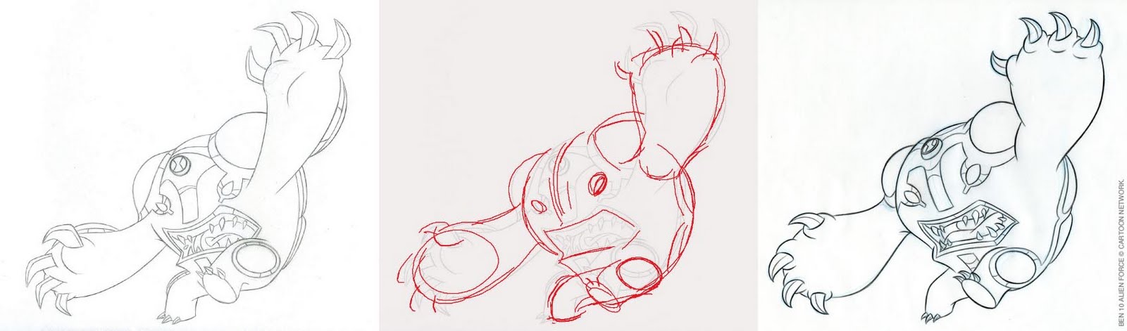
In recent years, compared with earlier years, I’ve accumulated ever fewer examples of projects where I’ve produced finished drawings. With most of the illustration projects at work handled in an assembly line process, much of my involvement is a type of quality control (a.k.a. Q.C.). Basically, I make sure other people’s drawings of Ben Tennyson, Humungousaur, and Rex of “Generator Rex” all look like Ben, Humungousaur and Rex compared to the studio’s character models.

Cannonbolt (Ben 10): This alien transformation of Ben’s can roll himself into a big ball and bowl things over. As with nearly all the “Ben 10” character models, Cannonbolt is drawn in a standing position, meaning there aren’t up front examples of how a character’s anatomy is supposed to work. Many artists new to Cannonbolt seem stumped by how his arms are connected effectively to where his ears should be on a giant head.
From left to right: 1) artist A takes a stab at Cannonbolt; 2) in red I rough out correction notes; 3) artist B does a new drawing.

Ditto (Ben 10): This alien hero can split off copies of himself. I don’t have any theories on what would make this little guy tricky to draw. But to my eye, I almost instinctively internally said, “not like that.” This not being the time or place for a “how to draw” the “Ben 10” heroes, I’ve presented these two examples with the assumption that the latter drawing are better and more on-model.
From left to right: 1) artist A; 2) my Q.C.; 3) artist B.

Monday, June 7, 2010

Girls for Sale

HeoresCon, June 4-6, 2010
Charlotte, NC


The general consensus around the hall was that business wasn't as good as hoped. Possibly attendance was lower. Definitely, folks just seemed to have a tighter hold on their monies - out side of the Saturday night auction I'm told.

Having naught but my experience drawing and painting personalized artwork on Disneyland's Main Street, my business of convention sketches surprised me by being fairly brisk.


"Rex"
Convention sketch.


With a 6.75" x 10.5" comic backing board advertising "CONVENTION SKETCHES $15.00 1 CHARACTER" I began Friday morning with a Rex from Cartoon Network's new action show "Generator Rex" in black sharpie on the slick side of another comic board.


"Ben, Big Chill"
Convention Sketch.

Second I drew a composition with half a Ben and half a Big Chill, one of Ben's alien hero transformations. Two halves equal one character sketch right? As I would on the remainder, I drew on the dull side of the comic board, except in the cases where I was drawing sketchbooks or other paper provided by the client (yes, some folks do anticipate having sketches done and bring their own paper stock).


"Samurai Jack"
Convention sketch.

In keeping with the Cartoon Network theme and as a marketing ploy I drew Samurai Jack thinking that would start to attract art patrons.


"Tinker Bell"
Convention Sketch.


And with the red and blue pencils and black pens I had brought, I continued to sketch characters in between "Hello"s and "Have a free button"s to attract potential business to the Monster Enterprises booth.


"Batgirl"
Purchased sketch.


Early on I even gave away two sketches, Wonder Woman and Scarlet Witch, to two young girls whom I'm not even sure recognized who the characters were, but were looking for free stuff. Their father almost stopped them, but I let them keep them. Merrill laughed.


"Belle"
Purchased sketch.


At some point some body stopped at the booth and was admiring the "Supergirl vs. Kid Flash" print we had on display and risked $15 on a commission for a Supergirl sketch.


"Green Lantern"
Convention sketch.


And that got a ball slowly rolling. We sold 21 sketches, with a total of 24 characters; of those 24 characters 20 were girls, that's over 83%.


"Zatanna"
Commission.


Saturday we (or I should say "I") were the busiest with the commissions with me drawing for most of the day. Merill had the brilliant idea to spread out some of the drawings I had done within easy view of passersbys. I even had repeat customers in the form of two brother a friend claiming to be patrons of the comic arts.


"Batman, Robin, Catwoman"
based on the cover of Batman #42

Commission.


Alas it wasn't until Sunday morning after having drawing the three-character "Batman, Robin Catwoman" piece Saturday night, that I had the brilliant idea to take pictures of what I was drawing. I guess that shows you the value I place on a 20 minute sketch.


"Space girl"
Commission.


So presented here are twelve pieces I had the presence on mind of which to take pictures starting Sunday morning. Pieces sold but of which I have no pictures are these:
4 - individual Supergirls
2 - individual Batgirls
Catwoman in some body's sketch book
Starfire in sketchbook
Mary Marvel
Supergirl vs. Kid Flash
Neil Gaimen's Death
Tinker Bell
Wonder Woman
Paul Chadwick's Concrete

... and as I said earlier, 1 - Wonder Woman and 1 - Scarlet Witch I gave away.


"Supergirl"
Commission.

Sadly, even though Samurai Jack caught many an eye, my first three, Rex, Ben and Jack, were set out on the table unsold for three days.


"Jungle Girl"
Commission.

Monday, May 31, 2010

120 [m ] : Ben 10 Art

Part of the function of the Illustration group at Cartoon Network is to create posed character art to be used on licensed product. While there are times art is created especially for specific product items (a.k.a. SKUs), most of the art for licensing business is created prior to the decision of what and at what quantities of product will be made. That art along with logos, color palettes, patterns and more go into a "Style Guide", kind of like an album of assets.


Character poses in rough pencil, "Ben 10 Alien Force"
Color pencil and black roller ball pen ink on copier paper.
2008.


Gwen poses in rough pencil, "Ben 10"
Color pencil and black roller ball pen ink on copier paper.
2008.

With such a schedule, there is a sizable amount of guessing done with these pieces, but generally the artists try to mix up the static with the dynamic, the left-facing with the right facing, and the ones towards the consumer with the ones off-stage interacting.

With Ben, who wears the ever important Omnitrix only on his left wrist, most of his poses have that arm coming forwards to the consumer. It's become kind of iconic. It's also, arguably, become a little boring.

With the alien heroes, and really most action characters, you get a lot of running and jumping. Hitting and kicking are good too, as long as you keep any swish lines and bursts under control.

Making a set of poses of Gwen, Ben's cousin, is a relatively rare assignment, since most of the network's programs are aimed more to boys. Here Gwen from the first "Ben 10" series is a ten-year old girl with magic powers. What she is not is a princess, a sexy video-game heroine or moody vampire. As such, it was actually fun drawing these.

Thursday, May 27, 2010

120 [m ] : Ben 10 Alien Force DVDs

Right on the heels of the Cartoon Network premiere of the animated action show "Ben 10 Alien Force" (2008-2010), itself the spin-off/ sequel of the popular "Ben 10" (2005-2008), the network's licensing group started rolling the plans for the consumer line of DVDs.


16 concepts for "Ben 10 Alien Force" DVD, vol. 1.


"Ben 10 Alien Force" DVD vol. 1
Final illustration.

Digital painting by Brian McGee.


For any given project like these, as few as three and as many as 24 iterations of concepts might be generated, usually on the "more" side when clients are involved. Past that, the illustration might be tweaked multiple times before it's called final.

With the first volume, I, as part of a team designing the packaging, was proposing not just one cover, but also the elements for the "Alien Force" line look - the visual bits to be carried through all the property's like packaging. Initially, the chosen concept was based on what is shown above here in the second row, second from the left.

Some thing like a week before work on the final illustration was to start, the white border was decided upon to go on all Carton Network DVD packaging starting in 2008. As a result, the entire illustration had to be redesigned. The three concepts to the right on the second row are part of that redesign as well as being proposals for the first three volumes' illustrations .


Three concepts for "Ben 10 Alien Force" DVD, vol. 2


"Ben 10 Alien Force" DVD, vol. 2.
Final Illustration.

Digital painting by Brian McGee.


Each volume in the DVD series as separate design projects, were spaced roughly about 3 months apart, meaning the delivery dates of the final packaging art were about 3 months apart.

The second volume would have featured Echo Echo, the small self-replicating guy shown in the first two concepts, until after research of the DVD's five episodes revealed that the guy just didn't have much to do in them. Four-armed Spidermonkey was chosen based on his presence on the DVD and his popularity for the 3-month old show.

With volume 2 as a type of template, volumes 3 through 6 would feature Ben and one of his alien hero transformations, and as a whole the decision to stick to that "template" would have its ramifications. Looking at the 9 different illustration concepts of the initial 16 concepts (the other 7 feature line look design explorations) and then looking at 5 of 6 covers featuring only two characters with logo centered at the top, does not at all display a straight line logic to the process, unless you follow the limited design and composition formula of "big main character in the center."

My theories regarding DVD package art, all of which which I have yet to convince my licensing clients, are these: a) be true to the property/ show; b) make it for the fan; c) don't try to win over the uninitiated, the person who has never heard of the property; and d) literally make it attractive.

Saturday, May 8, 2010

120 [m ] : Ben 10 Alien Force posters

"Ben 10" is now into it's third series, "Ben 10 Ultimate Alien," plus "Ben 10" has also spun off two live action movies.

The first, original series was created "Man of Action" whose site describes itself as "a Development/ Production House dedicated to writing, conceptualizing, and developing work of exceptional quality, commercial viability, and explosive creativity." If you're familiar with comics of the 1970's, it's a bit like "Dial 'H' for Hero" - a young boy has a device with which he may turn into any number of heroes with unique powers and abilities. In "Ben 10", 10 year old Ben accidentally gets the Omnitrix of alien origins and can turn into any one of ten aliens - well ten to start with.

The second series, "Ben 10 Alien Force" was turned over to Glen Murakami to helm, and it has a slicker design and slightly darker story line. Oh and Ben is five years older.


Poster concepts for "Ben 10 Alien Force" premiere
Pen and highlighter marker on paper.

2008


Poster concepts for "Ben 10 Alien Force" premiere tease
Digital over scans of pen on paper.

2008


How do you market and advertise what is in essence a sequel series - particularly when the licensed product line doing well (meaning that the importance of continued success is... important to a lot of people) . What do you show to get the audience excited? What do you tease or not show to leave as surprises in the watching? What about this will get the attention of an audience not already watching the original?

When the answer is dependent upon with how much money you have for marketing, you either run simultaneous campaigns of high conceptual teases and exciting reveals or you revise, revise and revise some more one or two key images. With the latter, you often end up with big heads and smiling faces - or in the case of an action adventure for kids, the ever-elusive and subjective "determined and fun-loving."

http://www.manofaction.tv/index.html

Thursday, April 30, 2009

120 [m ] - Ben There, Done That


Character sketches.
Black Prisma color on copier paper.

2007.

Rough composition.
Digital comp. by Brian McGee.
2007.

"Ben 10 Secret of the Omnitrix" final DVD cover, with "Only at" sticker.
Digital illustration by Brian McGee, Design: Petrika Janssen.
2007.

"Ben 10 Secret of the Omnitrix" (a.k.a. "Ben 10 SOTO") is the movie that capped the popular "Ben 10" series. Naturally, it was released as a commercially available DVD like rest of the series.

I've drawn lots and lots of Ben 10 art now, continuing into "Ben 10 Alien Force," and I think I've just about exhausted compositions getting his left, Omnitrix-wearing arm high and near the face. Then there's the behind-the-scenes drama of whether or not certain expressions are heroically determined and which are just angry. Otherwise, I like my job.

"Ben 10," all related characters and the Omnitrix symbol TM adn © Cartoon Network.