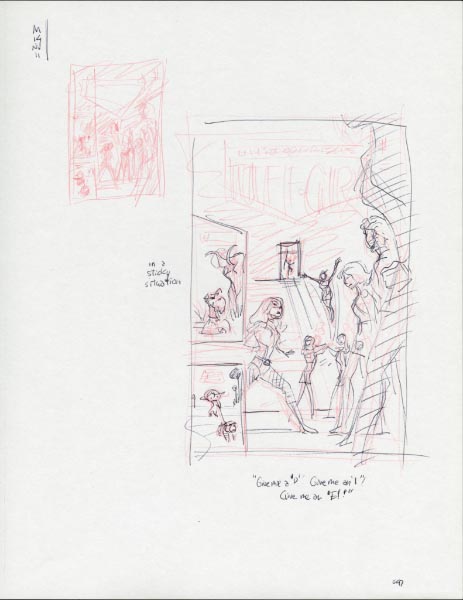
Pages

Friday, December 30, 2011

Wednesday, December 21, 2011

Mele Kalikimaka

Mele Kalikimaka, that’s the island greeting that we 
send to you from the land where palm trees sway. 

 
— Lyrics by R. Alex Anderson


Merry Christmas.
See you next year!

Saturday, December 17, 2011

Jim Valeri

Jim is a terrific artist working well both in traditional graphic media and digitally. Much of his career he has worked in product design and more specifically in toy design. Currently he is an illustrator/ Graphic designer/ product designer for the Disney Store.

2005, birthday 
in the style of Mort Walker’s “Beetle Bailey.” 
* * - - -

At Disney Consumer Products (DCP), we both worked in the same “house” as character artists from the start of my career in licensing and marketing and he already with the Pooh group, until I left and while he was heading up the toy group when DCP re-organized away from being property based over to lines-of-business based.

We would later work together under the “Cartoon” house, although I was in the Atlanta based part and he in the Burbank cased part on the other side of the country.

Jim’s blog: http://bigjiminy.blogspot.com/ 

[more Jim, 2009: http://monotonae.blogspot.com/2009/03/stepping-up-art.html]

Thursday, December 8, 2011

Brian McGee

Brian and I worked concurently as young artists at Disney Consumer Products for a few years, although as large as business was never on the same things. With random pieces of mail or phone calls people would get us confused, with us having the same name and same last intial.

To stave off more of that, I tried to to get people to refer to him as “Good Brian” to my “Bad Bryan.” That never caught on, and in that neither did my establishment of a bad boy reputation.

2005 
in the style of Tom Wilson’s “Ziggy”. 
* * - - -

Brain has solid drawing skills and a dramatic color sense. He also has a background drawing storyboards.

A few years later Brian was hired by Cartoon to specialize in digital illustration. Of note, he digitally painted the cover of a “Harvey Birdman” video game and several “Ben 10” DVD covers.

Brian’s blog: http://brianmcgee.blogspot.com/

[more Brian, 2009: http://monotonae.blogspot.com/2009/03/stepping-up-art.html]

Monday, November 28, 2011

Tom Shutt


Going Away Card, 2011.
Light blue pencil and black roller-ball ink on paper 
* * * - -

Tom worked as a designer for the off-channel print group for at least seven years (calculated merely based upon the earliest caricature I have of him).

2005, birthday
In the style of Charles Schulz’s ”Peanuts” 
* - - - -

Just as most all of the designers, he had worked on a good number of DVD packaging suites and posters. Beyond that, it seems that he applied himself to several environmental design projects including a few re-designs of the lobbies of the Network’s office floors and the Cartoon Network store at CNN Center, Atlanta.

2004, birthday
In the style of Hanna Barbera studios, circa 1960. 
* * - - -

The one thing that that stands out in my recollections about how/where he’d applied his talents out side of work is a fashion show where everything was constructed out of paper.

[more Tom (2009): http://monotonae.blogspot.com/2009/07/off-wall.html]

Friday, November 25, 2011

Elizabeth Beasley

Going Away Card, 2011
Light blue pencil and black roller-ball ink on copier paper.
* * * - -

Elizabeth worked as a writer for the network’s off-channel business for several years (five maybe?).  For example, if you’ve read the back packaging of one the DVD volumes of a “Ben 10” show, then you’ve probably read her work.

She was involved with the Gorgeous Ladies of Comedy group in Atlanta (http://www.myspace.com/gloc). She spread her interest in improvisation to help folks at work access their creative inner beings while avoiding blocking others’ creative beings - or tried at least.

[more Elizabeth (2009): http://monotonae.blogspot.com/2009/07/off-wall.html]

Tuesday, November 22, 2011

Face It

Cover, “Unstoppable Tuff-Girl” issue No. 2
carmine red pencil and 
black India Ink on Bristol Board
27.94  x  43.18 cm (11.00 in.  x  17.00 in.)

This is the inked cover to the next issue of “Unstoppable Tuff-Girl”

The girl in the foreground is a bit disproportionate, but the mast head and some snipes at the top conceal the most offending parts of the figure.

conceptual sketches

Unlike the dozens of thumbnail conceptual sketches made for the cover of issue No.1, I attacked this one by the sheer impulse of getting it done over the weekend.

The main “Tuff-Girl” section isn’t a repeat of the teaser advert. at the end of issue No.1, mostly because it didn’t need to be. It does, however, echo better the art drawn for the actual story. Namely, it includes the silhouette of Dr. Dockter.

Note my refusal to draw a complete wall of stadium seats, much less people in those seats.

Tuesday, November 15, 2011

Isis Booker

Logistics involving paper, writing instruments, local selections of people and my attention not otherwise engaged govern of whom I draw caricatures - in other words I mostly draw the people I work with and much less so people outside of that circle.

Isis worked licensing and was one of those folks who have the thankless task to guide the makers of things (licensees) to properly reproduce characters to the liking of the owners of those characters (licensors) and hopefully to the liking of the fans (consumers).


2008
red ink on paper
* * * * -

What Isis likes, she LIKES. She likes Disney, and tries to visit one of the Magic Kingdoms every year. She likes anime and so learned to speak and read Japanese. She likes Dragon*Con and attends in different costumes each of the first three days of the fantasy/ sci-fi convention.

Sunday, November 13, 2011

Matthew Crouch

Matt Crouch worked just a few weeks short of 13 years as an off-channel designer at Cartoon Network, Atlanta; as such he’s work there for all the time that I have. (Off-channel roughly is everything that’s not “on-air” and includes billboards, and all sorts of printed promotional items like tee-shirts, trade collateral and etc.)


Going Away Card, 2011
light blue pencils and black roller ball ink on paper
* * * - -

Matt was one of the folks I knew who was fired two weeks ago. I drew the above faceless, faux-Hirschfield caricature above for his going away card.


2010, Speedy Recovery
carmine red pencil and black India Ink on paper
* * * * -

Matt was interested in fitness. He would go biking - I’m saying on mountains and stuff? He also did that P90X extreme workout. In my caricatures of him, I would exaggerate broad shoulders and wide chest.


2005, birthday
digital composite with cleaned scan of India ink
based on the anime style of Inuyasha
* * * - -

Matt likes comics, Star Wars and Japanese anime and manga and his cube was always an expression of that full action figures and statues. As a design art director, he was cast to work on action shows including the many Ben 10 series and Star Wars Clone Wars.


Matt, in his own words, also likes drinking, an aspect that anyone would find difficult to incorporate into marketing kids shows.


2004, birthday
digital color with cleaned scan of ink
vehicle based on the Swordfish II from Cowboy Bebop
* * * * *

When putting together my Merrill’s and my comic book feature for Tuff-Girl, I hired Matt to design a logo. When Merrill and I expanded the idea to the independent comic book, Unstoppable Tuff-Girl, I again asked him to design that logo. I want to see those logos on everything from tee-shirts, socks, tailgates and—movie posters.

[more Matt (2009): http://monotonae.blogspot.com/2009/07/off-wall.html]
[more Matt (2010): http://monotonae.blogspot.com/2010/11/matts-back.html]

Gourd-geous


My Jack-o-lantern for this past Halloween. I played it safe by basically drawing the face, peeling away the “white ” parts. It’s teeth were pumpkin seeds.

Friday, November 11, 2011

Ed Murrieta

I wonder why someone isn’t telling the true stories that I want to hear. That’s actually a poorly assembled sentence with a consumerist’s point of view filled with conditional assumptions. Who is this rhetorical “someone” read as “someone else?” What are true stories, and what make them true? Are they actually not being told or have I just not heard them? And most insidiously, by what criteria would a story need meet that I would want to hear it?

But to the point, it’s this thought that bubbles to the surface of my consciousness when people leave. From that point forward all the things you shared with those people are categorically in the past, as if suddenly they were placed in a vault apart from the lobbies and living areas of your daily life. Am I the one who supposed to tell those stories? Ack, I should have been taking better notes.

Two weeks ago several people were fired from the Cartoon Network Atlanta offices. Ed Murrieta was one of those people.

Going Away Card, 2011
light blue pencil and black roller ball ink on paper.
in a minimalist Al Hirschfield-esque style.
* * * * -
In this and three other caricatures I again attempted to mimic Al Hirschfield’s caricature style but without facial features. For me it was more about expedience and meeting a deadline and not a conscious political statement. I’ve known Ed for about 15 years. He hired me to be a character artist at Disney Consumer Products, and he was my boss for about three years. At the time, I once said that he was the best boss I had ever had. It was a cheeky thing to say since he was also the first art-director/boss I had.

2010, Birthday
acrylic paint on vinyl figure
* * * * -
 In 2000, Ed was hired for an art-director of illustration for Cartoon Network’s off-channel business. I quickly asked him to whom at the then nine-year old network I should send my portfolio. Ed said that was going to be one of his responsibilities. Ed has been my art-director/boss for the last 10 years and Cartoon.
 
2005, Birthday
digital color over scan of ink on paper.
in the style of Johnny Hart’s B.C.
* * - - -

Ed worked as an animator for Walt Disney Feature Animation in the mid to late 1980’s. He left that seeking more stable employment at Disney C.P. along with many of his animator friends. He returned to work on Atlantis, animating Audrey. There’s a caricature of Ed as an Atlantean in the film. It’s arguable if the “Big Boy” mascot for the diner in The Emperor’s New Groove is also a caricature of Ed.

2004, Birthday
digital color of scan of ink on paper.
In the style of Al Hirschfield.
* * * * *

Ed told me that this drawing done for his birthday in 2004 was his favorite of my caricatures of him. He likes Hirschfield and he likes life drawing, so I felt that in drawing it I was on the right track. You can’t see it in this terrible JPG, but I incorporated in the drawing his son’s name eight times.

2003, Birthday
black roller-ball ink on paper.
* * * - -
 
Knowing Ed for so long, I think I’ve drawn more caricatures of him than anyone else to date. Mostly, they have been embarrassing birthday cards, few of which I’ve had the forethought to make copies.

[moreEd (2009): http://monotonae.blogspot.com/2009/03/stepping-up-art.html]

Monday, October 31, 2011

Beach Holiday

 
Carmine red pencil and graphite on copier paper, detail.
5.08 x 7.62 cm (2.0 in. x 3.0 in.)

Watercolor on paper, detail.
5.08 x 7.62 cm (2.0 in. x 3.0 in.)

As soon as fall hits, the clock starts; the countdown to the end of another year and the beginning of a new one. In between, there arise successive holidays each bigger than the last. On my mental production schedule, the autumnal equinox means that it’s time to start on Christmas cards.

This year it concerns Little Tuffy and the Tuf Gurlz, a front-back spread and in watercolor. I’ll reveal the whole image some time after the New Year (sooner perhaps on “Fan of Bryan Mon” on FaceBook). However, in this detail, I demonstrate my restlessness as an artist; meaning that as long as I’m working on a piece of art, I’m tweaking it. In the draft, I roughly drew the layout in red pencil. I then transferred the image to watercolor paper by rubbing graphite on the back and drawing over key parts with a hard graphite pencil. 

You’ll note that I did not transfer the seaweed vines (at top wrapped around a cluster of surfboards), nor by accident the sandman’s hat. The prior allowed me to finalize the seaweed pattern on the watercolor paper more cleanly. The latter only meant that I had to draw a new hat. I might not have redrawn a wider brim in the transfer process, but certainly being forced to draw a hat granted me liberty to do do so or draw a different style hat if I wanted.

Everything else, including placement of shadows to suggest the undulating surface of the beach is part of the coloring process. I’m only a painter because of a medium. But more accurately, I am a colorist, layering on colors to manipulate focus, suggest temperature or emotion, or as I did here, add spots of red and green because of the Christmas theme.

Thursday, October 27, 2011

Roasting on an Open Fire

Little Tuffy and the Tuf-Gurlz
Camping on the Beach
conceptual sketch
Scarlet red pencil on paper
2011


Monday, October 17, 2011

Elves Be Seeing You

Red and blue roller-ball ink on paper.

Christmas must be nearing, because I drew elves to-day.

Meanwhile, ...

Page 5, Panel 3, “Give Me a ‘D!’ Give Me an ‘E!’ Give Me an ‘I!’”
Scarlet red pencil and black India Ink on Bristol board.
25.72  x  12./70 cm  (10.125 in.  x  5.00 in.)


Panel 2:
Close up of the trophy. Doctor Dockter's hands are on the bottom of the trophy. Some of the girls' hands are reaching in for it. The trophy looks weird at this close view. It has strange markings and skulls on it. The girls are grabbing the trophy, and a sort of electricity is shooting through them and crackling over them. 

Cheerleader: We won! 

Panel 3: 
They look like they are in agony. Doctor Dockter is behind them in silhouette, smiling. Closer in on one of the girls in mid transformation. Their clothes are ripping. They’re kind of hulking out. 

Caption: But wait! A strange energy pulses out of the trophy...

— excerpt from the script by Merrill Hagan.

Some times when working from a script, I can just draw what’s written on the page. Most times, I pause and ask “what would work better?” As the editor-in-chief and publisher, I empower the artist (me again) to make changes - not changing the story but clarifying the story by shuffling or editing components of the script.

As an example, the actions described in panel 2 were just too numerous for a static image. It’s a close-up of the trophy and a bunch of hands (Dr. Dockter’s and the cheerleaders’). Added on that electricity effects crackling over the cheerleaders, whom would be indistinguishable if they’re only represented by hands.

So I instead introduce the electricity effects to panel 3, even though it would have carried into panel 3 any ways. The result is a more dramatic contrast between the states of before and after when the cheerleaders grab the trophy. 

I chose to remove Dockter from both panels 2 and 3 since he commands 1 and returns in 5 with the beginnings of a declaration, making 2 and 3 entirely about the cheerleaders’ experiences. On the reader’s part, she/he assumes the all noted characters remain in play for the entire sequence even if they’re not all depicted in every panel. By that reckoning, the reader should also be assuming that Tuff-Girl, last seen on page 2, is still around seeing all this craziness.

Wednesday, October 12, 2011

MegaCon 2012


I’ve signed up for a Indy Press booth at next year’s MegaCon in Florida. Part of that package is an opportunity to advertise right on the MegaCon web site in the form of a button at the bottom of the page.

Set the date on your calendars.

Feb. 17th - 19th, 2012
Orange County Convention Center Hall D
9800 International Drive 
Orlando, FL 32819

Tuesday, October 11, 2011

A Turn Styled

“Manga” styled Tuff-Girl, sketchbook drawing.
Scarlet red pencil and black ball-point pen on paper.
2009

Starting with Speed Racer, Battle of the Planets and Space Battleship Yamato, Japanese animation has been an influence on my art. To be fair, the Walt Disney animated features and Warner Brothers’ “Looney Tunes” shorts were a bigger influences. So it’s probably a fair statement that my “Manga” style isn’t really like any Manga book you might pick up at your local comic shop, even when considering styles vary with the artist.

Here, Tuff-Girl’s gauntlet is an electro-magnetic sling. On her right wrist, I guess, is where she holds her steel shot to use with her sling.

Tuesday, October 4, 2011

TAGS, May 13, 1994

- Truth and Condiments -
India Ink on paper.

With a restaurant that operates sixteen plus hours a day including prep and closing and with a staff of close to a hundred crew members working overlapping shifts each of 4 to 8 hours long, the resulting combination of folks taking their breaks at the same time are at once random and limited. The break room setting became the most common device for mixing up the characters, exploring how the they might interact, especially when not dealing with the core “go to” characters.

In one such break room scenario, Monster sat with his imagined rival Even (Welsh Corgi, 5th appearance) with a discussion spurred by the appearance of Monster’s crush, Polly (penguin, 20). The subtext involved Evan, without realizing it, was the catalyst for Monster’s expressed insecurities. The failings of my Tags production schedule meant that there was only one strip prior to set up the Monster/Evan dynamic.

“The Apple Tree” dance was totally a high-school convention that had no counterpart in the operation of a major theme park or much less a restaurant operating within a theme park (which was where Tags was set).

There were a few strips where Monster was the quiet observer. Unfortunately, there’s no room in a daily strip series for a quiet observer unless he’s effectually a bit of property/ set dressing. If there’s one thing I like about this strip then it’s the opportunity to show Monster’s inner Charlie Brown.


Panel 1 (L-R as board pieces): Shirley (seal, 3), Suzie (deer, 3), Polly, Fern (kangaroo, 4), Bingo (snake, 3), Monster, Evan, Guy (dalmatian, 3). At the top is Monster in a Naval Commander’s uniform. The Submarine is of course designed after the Battleship game piece.

Monday, September 26, 2011

Off Key, On a Donkey

 Red pencil and black ball point pen ink on paper.

Digital color over cleaned scan.

“What should I post on monotonae today?”
I drew this while watching “The Sing-Off”.

Tuesday, September 20, 2011

As Sif I Had the Time

 Sif c. 1984
Scarlet red pencil and black India Ink on board.
17.15 cm  x  26.67 cm  (6.75 in.  x  10.50 in.)

Digital color over cleaned scan.

It’s no surprise that comic book conventions are about super-heroes, in America at least. When I do commission drawings sitting at a comic book convention (maybe at the Monster Enterprises booth or at a four-foot tablette on artist alley), I get to draw a lot of super-heroes. 

The demographic of folks who want to spend good money on a commission of their favorite characters tend NOT to be eight year-olds who REALLY love Ben 10. Rather they are older readers who want to celebrate their nostalgic fondness of characters from silver age (1960s) to 1990s. Luckily, I like that stuff too, so most of those commissions I can do from memory. 

Although my memory is not photographic, I do retain much from doing just one drawing of every new character or costume design. So this represents me practicing*, the first in a series I started this year with the following calculated benefits:

1. Practice drawing new characters and maybe new costumes.
2. Practice inking with ink and brush, sometimes as a warm up to inking a page for my comic book.
3. Use for those packs of comic book backing boards I bought**.
4. Practice using colored markers.
5. The marker colored (below) pieces I can sell at comic conventions. As an unknown artist, it helps to have a portfolio for folks to flip through, and sales-wise, having stock for “quick sale” is good.
6. Maybe stuff to post on monotonae.
7. After a couple of dozen, I can assemble and print them in sketch books, book which I can sell at conventions.

Scarlet red pencil, black India Ink and marker on board.
17.15 cm  x  26.67 cm  (6.75 in.  x  10.50 in.)
* This is what I did with with the Disney pantheon of characters up through the 1990s when I worked for Disney. I can still whether through a session of “stump the artist” when it comes to Disney characters.

** At my first comic convention, I discovered that colored pencils barely showed and marker based inks wouldn’t be taken fast to the coating on the face of the boards I had purchased, backing board commissions slipped into protective comic book bags was my whole plan for doing commissions. I was fortunate in that the reverse was not coated, and that was the side on which I drew. The subsequent re-stockings of backing board, actually resulted in a stock of a couple of packs with boards coated on both sides.

Monday, September 12, 2011

Gosh, That’s Scary

Panel 6, page 11
“Tuff-Girl versus the Amazon Cheerleaders”
Scarlet red pencil on Bristol Board.
Script by Merrill Hagan.

Tuff-Girl Versus The Amazon Cheerleaders, Second-Half Draft

Here I present the last six pages of twelve of a “Tuff-Girl” feature to appear in issue number two of Unstoppable Tuff-Girl, each from thumbnail sketch to rough draft layout.

Page 7: Although not scripted, there are numerous little things about the costumes that I have to track from panel to panel. As the story progresses for example, Tuff-Girl loses her jacket and skirt. With the eight cheerleaders, their uniforms get torn in various states. Then I complicate things further by returning Doctor Dockter’s hat not present in the first rough layout.

Page 8: The change in panel three to have Tuff-Girl struck across the face rather than being socked in the gut was to better carry off their size differences. As a result, space opened up for the sound effect.


Page 9: Panels 1 and 2 are actually four panels, and I sure hope is reads that way in the final book. I had toyed with the idea of making it two-halves of a single long panel. The other complication of my own devising, is keeping track of the cheerleaders. In the script, the cheerleaders are generic. I wanted to avoid having cheerleaders recovering too soon in a panel right after Tuff-Girl knocks her down in a prior panel.

Page 10: By the fifth panel, the story unavoidably addresses the audience space in the auditorium. Here I opted with empty seats to suggest that most of the spectators have run off for fear of being hit by a stray pom pom or something.

Panel 11: Finalizing Tuff-Girl in profile in panel 2, makes Dr. Dockter more of an incidental and less another participant when it’s about Tuff-Girl talking down the cheerleaders. I think in panel 3, I got tired of panels with eight girls standing around. I don’t know if it was the right decision. With panel 5, I make use of a common comic layout device, silhouettes. A panel of silhouettes, breaks up the page layout, and works because the surrounding panels contain the same characters without all the visual details.

Panel 12: I changed the camera angle in panel 2 so that it didn’t contain another vertical element on the same page as the 3rd and 5th. The girls of panel 3 were re-positioned for the same reason.

Next: Inking.

Tuesday, September 6, 2011

TAGS, February 06, 1994 - color

Digital composite of India ink and watercolor, 
with digital color of the logo.

[link: Black and white version] as originally published.

As I retroactively color these full-page strips, the order has been hap-hazard. That’s just facts, and not so much an apology. I suppose I apologize for taking seventeen years to get around to coloring them at all.

Tuesday, August 30, 2011

Friend or Foe?

I was lead to this site, Project: Rooftop, that is best described as a blog where fans may share their fanaticism in the form of redesigning super-hero costumes. On the surface, it sounded to me like a well-meaning effort in support of less than stellar ideas and art work. To my surprise it's not.

Project: Rooftop is co-founded by Dean Trippe and Chris Arant.

http://www.tencentticker.com/projectrooftop/

In support of their efforts, and to test the openness of their submission policies, I made this, which is based on the cover to Action Comics No. 252, which introduces to a surprised Superman a blonde girl in a costume of similar details as his flying out from a crashed purple rocket ship. The cover asks of the “Supergirl from Krypton” “Is She Friend Or Foe?”

Supergirl TM and © DC Comics.

Monday, August 22, 2011

Little Tuffy Backyard Surfing

Red pencil and black ball-point pen on paper.
Digital color over cleaned scan.

Something I drew today.
Little Tuffy with Wilson and Catalina.

Tuesday, August 16, 2011

Five Gotta Feelin’


 Supergirl & Brainiac Five.
Red ball-point pen ink and black India Ink on paper. 

Digital color over scan.

Here’s something I drew in one of my sketchbooks. I don’t think I intentionally left off B.5’s right hand glove detail, but in coloring it, I decided to go with what was there.

Supergirl and Brainiac Five © DC Comics.

Monday, August 8, 2011

TAGS January 16, 1994

Digital composite of India ink and watercolor, with digital color of the logo.


I think I’m getting close to a process for digitally combining separate scans of the ink and the watercolor which is over an ink-jet print out of the scanned ink.

I initially tried making each of the first seven panels seven different monochromatic schemes, but adding Monster’s blue threw that whole thing off.

Tuesday, August 2, 2011

Tuff-Girl Versus The Amazon Cheerleaders, Half Draft

Here I present the first six pages of twelve of a “Tuff-Girl” feature to appear in issue number two of Unstoppable Tuff-Girl, each from thumbnail sketch to rough draft layout.

Page 1: I drew the thumbnail sketch of each layout in the margins of Merrill Hagan’s final script. For no particular reason, I used red ballpoint pen. Next, to get a better sense of spacing and lettering, I drew “at scale” layouts on letter-size copier paper in black roller-ball ink. On 11" x 17" Bristol board within a 10" x 15" rectangle I make the rough-to-tight pencil layout that’s the stage prior to inking. With the details of her costume not scripted, I decided to start Tuff-Girl in a jacket.

Page 2: I think I showed Merrill the thumbnail layouts as work-in-progress samples, but I kind of doubt he could make out a lot of my design decisions. This page sets up the idea that Tuff-Girl and a gentleman named Doctor Dockter are judging a cheerleading competition. In panel 5, the doctor gets a top hat.

Page 3: The script called for three consecutive panels with the same background and unmoved Doctor Dockter. I rebelled against that idea in a quest to somewhat emulate Milt Caniff’s panel layouts, and he never drew the same background twice. On “Terry and the Pirates” Caniff also kept to regular panel layouts, so on the final rough I switched back to the six-panel grid.

Page 4: This is the page that first tested my resolve to do the best for the story, a story that has cheerleading teams in front of an audience; in other words lots of crowds. The addition of Tuff-Girl in panel 4 is for added dimension. Prior to the rough layout, the girls have not been drawn as specific characters with specific features. Before proceeding on the rough layouts, key members of the team had to be identified with initials (not shown).

Page 5: With eight members of the team transformed into Amazon cheerleaders, some times that’s plenty to fill a panel, and some times (panel 4) less so.

Page 6: I like a Jackie Chan action sequence, by which I mean letting the characters utilize objects, furniture and aspects of the environment in what they do. The jacket added to Tuff-Girl’s costume in page 1 is something she can use to tie up the hands of a charging girl in panel 5 here.