Pages

Showing posts with label art and design. Show all posts

Wednesday, June 14, 2023

Tuff-Girl- Action!

This is the 2023 Tuff-Girl Poster print.

In keeping with the 1960’s - early 1970’s era of inspiration I drew upon 2 sources of inspiration.

First is the 1969 cover of Action Comics No. 373. Pencilled by Curt Swan and Inked by Neal Adams. It was after a little internet research, that I had learned to whom to credit the art. I think perhaps with Superman in the bottom right corner, that one could spot Swan’s style. What I think threw me off that scent and into thinking that the penciler was emulating Swan’s style was the not-typical-Curt-Swan’s-Supergirl face of the central figure. Knowing what I know now, that’s Adams’ style bleeding into the face render.

In my original, concept sketches, you can see me attempting to stick closely to the Supergirl design with a skirt, inspired boot designs and the same hair do. I would have added a cape if that was something with which Tuff-Girl accessorized her costume.

The secondary inspiration is the promotional poster for the James Bond movie Dr. No by artist, Mitchell Hooks and designed by David Chasman. 
 
As I have developed and improved as an artist, the more that I like art styles that are rougher and incorporate peeks of the art processes or, as they say, the artist’s hand. In the poster version with five different spot colors for the figures, the black screen is Hook’s drawing.

For my base drawing, I broke Swan’s Supergirl pose with more asymmetry and contra-posto to have her stepping out of the hole instead of her hands and feet holding open the hole. The torn hole, is less the white framing device of the DC Comics cover, and as a result is a stand-in for a sun burst motif. To make the rough drawing feel communicate, I used a black Prisma Color art pencil on a 9” x 12” piece of water color paper, expecting to enlarge the image of the print.

In my digital color of the art, I soon jumped away from borrowing the monochromatic or spot color look, and settled with playing with the idea of the interaction of only printed magenta and yellow screens underneath the black screen of the drawing- no cyan screen. With different levels of magenta and yellow there are ranges of pinks, oranges and reds to play with. The direct painted version seemed to be lacking. So knowing that I was playing with the 2-screens idea, it was a short creative leap to have Photoshop create coarse half tones of the magenta and yellow.

Siding with the Dr. No poster, I silhouette Tuff-Girl against white rather than the black of the Action Comics cover for a back-lit effect. The triangular page tears working with the white background further implies the sun burst motif, intentional or not.

For my convention exclusive version, I recolored the surrounding “page” to a near-black, deep rose color and pulled back to fit the top-left tag while revealing more of the art.

I often try to have my Tuff-Girl posters feature her with her dog Wichita. I’m sorry that I opted not to include Wichita in the final image. She threw the composition off balance.


Monday, January 17, 2022

Mapplicable

 D23, The Official Disney Fan Club, has announced the 2022 D23 Gold Member Collector Set. It’s the exclusive gift that every new and renewing member receives.


For more information about the club, please go to the D23 site, naturally: https://d23.com

My contribution to the set, was a world map that is the backing board for the real prizes that are a seven-piece set of exclusively designed enamel pins. Each pin features one of the six Disney theme Park Resorts plus a seventh for the Disney Cruise Line. To be clear, another artist designed the pins.

All two-dimensional maps are necessarily stylized representations of three-dimensional features existing on a spherical globe. In this, I chose to build the land masses from circles and parts of circles and a few straight lines.

The characters and things iconography on the final piece of art are all blues, teals and purples so as not to compete with the pins. 


However, there were more colorful early versions.

conceptual sketches

Many of the animal elements are inspired by those found on the “it’s a small world” attraction: hippopotamus, tiger, penguin, llama, kangaroo, and goose. I think the animals for the attraction are more Rolly Crump designs inspired by Mary Blair’s stylization than purely coming from Blair’s work for the boat ride. Keying off of the style, I chose other animals and things as nods to other Disney things.

Sea Serpent - Disneyland’s defunct Submarine Voyage attraction

Parrot - Rosita from Walt Disney’s Enchanted Tiki Room, Adventureland

African Bull Elephant - Jungle Cruise attraction, Adventureland.

Polar Bear - Walt Disney’s White Wilderness (1958)

Big Horned Sheep - Grand Canyon diorama, part of Disneyland’s Railroad experience

Baobob Tree - Disney’s Animal Kingdom’s Kilimanjaro Safaris attraction

Steam Locomotive - Walt Disney’s love of trains

Baby Oyster - Walt Disney’s Alice in Wonderland

Moose - Disney’s Brother Bear

Aulani Resort and Spa main building

747 Jet Airplane - Intended align with the “travel” theme to embellish a title box that didn’t get included on the map

London Tower and NotrĂ© Dame Cathedral couldn’t fit on the map and were eliminated as candidates

I am pleasantly surprised to see that the D23 designers had taken the purple grid pattern I had created for the map’s oceans for the background and repurposed it for the collection’s passport cover. For this pattern, I was inspired by the tiles of the Mary Blair murals that once flanked the Tomorrowland corridor in Disneyland. In fact, the square tiles were cut from a larger pattern of waves and mixed up. It is possible that many of the tiles can be reassembled in a few continuous lines. That’s trivia, not a challenge.

conceptual sketches

early green & blue version

exploratory purple & yellow version

early red & purple version


Tuesday, June 2, 2020

Logo Grow

Is a company a real company if it doesn’t have a logo? Not if you judge it by American capitalism since, oh, 1960.

Starting in high school, I played around with logo designs as an extension of musings about what would I call my own company. This, in turn, was the natural extension of the high school activity of thinking about what one would do after high school. Designing logos was the easy and fun part.

I came up with logos for a variety of businesses:
  • Illustration services
  • Engineering design
  • Film company
  • Detective agency
  • Animation studio
  • Apparel design
  • Distribution company

They all happen to be creative outlets. Considering that I would be pointing my nose in the direction of university engineering studies, these diverse pursuits could have been a premonition of the mega-corporations of today. Or perhaps not. I don’t think Amazon or Warner Brothers either have detective agencies in their respective families of divisions.

It was a fun exercise. The fun was topped by imagining a corporation for them all. That corporation was called Monster Enterprises. If you’re paying attention, “Monster” is a play on my last name “Mon.” It was an is better than most other puns on my name like “Monkey Co.” and “Money Maker, Inc.”

In college, I developed a character called “Monster” which was to be what Mickey Mouse was to Walt Disney. Intentionally, I took the three letters of my last name and mashed them to be the basis of Monster’s face. With that, I moved to formalize the corporation idea with a logo that used the same Monster’s face that served double duty as the “Mo” that begins “Monster.” Unfortunately, right now any copies of drawings of that character are buried deep in some moving box. I think I attempted a visual link by pairing the “TER” common to both “Monster” and “Enterprises.” I still think that maybe I should conflate the two into “Monsterprises.”

Monster as a character evolved as needed in a couple of comic strips all while serving as the corporate mascot. Around 2010 or as late as 2013, I re-designed the corporate mascot Monster to be specific and distinctly different than the ones used in comic strips. Much of this design, borrowed from my Cartoon Network job. Think Fred Flintstones and “Billy and Mandy“ as the nose inspiration.

By 2013, the corporate logo was updated with the new corporate mascot design. Here, I pushed the letter forms to NOT be reminiscent of the “Disney” logo type. The forms have saw-tooth jaggedness, asymmetry and breaks. Here, also, Monster’s ears were left off for better “Monster” legibility.

For the logo icon, Monster’s earless face was isolated and often is placed in a circle. 

This year, Monster’s face has been completed with ears and a defined face/head shape. It seemed necessary for the icon/logo. While I attempted to place the new head into the logo type, in doing so hampered legibility. Too many thick lines, I think. Other detail adjustments include a slightly smaller face compared to his nose and the long cowlick hairs were changed as to not appear to be an “F” and an “N.” Since the icon and the logo type are different, the icon head can be a bit rotated counter clockwise.

I wouldn’t be surprised if the logo gets re-designed again within ten years. That seems to be what all the big companies do.

Saturday, March 28, 2020

Working from Home


With COVID-19 impacting the world, the Walt Disney Company quickly cycled through allowing, encouraging, facilitating and then up to nearly mandatory making work-from-home policies for its employees. With the Products group being “entertainment-industry-adjacent,“ my Disney department quickly took up the opportunity and Friday March 13 we all began the WFH life. 

Following the social media trend of artist’s sharing snapshots of their home work spaces, here is mine. 


It’s a mess. 

If you’d like to spend a few minutes of your day as a minimal escape from the world’s concerns, then you can play this game of find these 20 things. The prize is giving yourself a socially distancing pat on your own back. 

Let me know in the comments how long it takes you to spot all 20.
  1. 1)  Painting easel
  2. 2)  Box of sketchbooks
  3. 3)  Grey water tub for painting (with 2-paint brushes in the rim holes)
  4. 4)  Box of Ziploc® bags
  5. 5)  Stack of paper pads
  6. 6)  Superman
  7. 7)  Small, white electric personal fan
  8. 8)  Bottle of Elmer’s® Glue All
  9. 9)  Black/ dark grey fishing tackle case (for art supplies)
  10. 10)  Wooden folding chair
  11. 11)  Pickle jar
  12. 12)  Supergirl
  13. 13)  3 metal rulers of different sizes
  14. 14)  Mickey Mouse alarm clock.
  15. 15)  Black manual pencil sharpener
  16. 16)  2 heavy duty moving boxes that have been cut down to half size
  17. 17)  Collected lanyardsof different colors (but mostly are black)
  18. 18)  Digital picture frame
  19. 19)  White clip-on light
  20. 20)  Pack of 9-volt batteries
There are plenty more thing in the picture, but the task of visually identifying them is thwarted by the picture resolution and/or, like many of the boxes, have little or no distinguishing features. For example, I can see the paper shredder, but there’s not enough of it visible from this angle for anyone else to make it out, although with those clues, I’m sure many of you can propose an educated guess or two.

Stay safe. Stay healthy.

Sunday, January 5, 2020

The Mappiest World in the Place


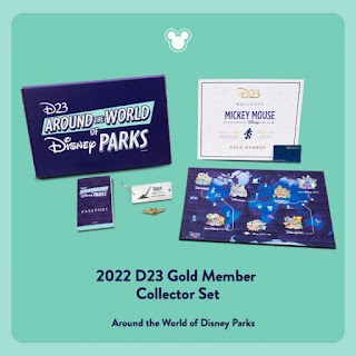
With the New Year came D23’s introduction of the Official Disney Fan Club’s 2020 Gold Member Gift. With every new gold membership subscription and renewal to D23, an amazing gift package is delivered a (what may be obligatory) certificate of membership and a membership card. Disney then plusses things by assembling it into a whole gift package of exclusive (I’ll say generically) stuff. For the memberships processed in the calendar year 2020, they have put together the D23 Fantastic Worlds Adventure Kit.


One small part of the kit which I contributed is a map.


You may read about the entire kit at D23.com

Of course, that’s where you can learn about the club itself, it’s events, offers and other Disney news.

If you, for example, renewed your membership this last Christmas, then you’ll be receiving the 2019 gift of beautiful enamel pins.

To keep the map an exclusive surprise, I won’t be sharing detailed images here on my blog, Instagram or other social media branches until later in the year. I will, however, tell you a behind-the-art tale of making the thing.


Fantastic Map-ortunity 
“Where’s the Matterhorn on this thing?”

Mid July 2019, a Disney colleague pitched my name to work on part of the 2020 Gold Member Gift. The D23 group wanted new designs for a map, a set of enamel pins, badges and postcards with room for more stuff budget allowing. At this stage, the package was forming both creatively and budget-wise. My colleague said that I’d be specifically perfect for creating the map, based on a few past projects in which my knowledge of Disney came in handy. I suppose that I’ve also demonstrated the willingness to put in the work on big art projects.

At this early stage, the “wish list” brief consisted of maybe 20 well-known Disney, Pixar, Star Wars and Marvel places. I doubt that anyone really had a clear idea of how a map could depict houses, cities, countries, moons and planets in a comfortable scale. Some of the inspiration examples that they sources were very simple and graphic, and along those lines perhaps scale wasn’t a limiting factor. The D23 group did imply that maybe the Star Wars and Marvel parts were still “maybes”, that they might not be part of the map of “Fantastic Places” as they were then calling the whole package. At this pitch stage, the size of the map hadn’t been dictated except for knowing that everything would have to fit inside the gift box no large than 35 cm (14-inches).

I accepted with that loose description. With so little known, it allowed my mind to make up the rest. I decided that the map would have to expand to represent hundreds of different movie and television properties and draw inspiration from the classic “Disneyland Fun Maps” that were sold in decades past. It would have to be 36-inches long (91 cm).


Fun for All 
The Disneyland Fun Maps were artistic representations of the one and only (at the time) Disney theme park. It may not have been at true scale, but it did function like a real, printed map. It was folded in a specific way as to display in a shelf pocket in the Main Street Emporium showing a section with a legend and quote of Walt Disney’s opening day dedication, all tell-tale signs that the object wrapped in cellophane was a folded map. It had every attraction, shop, restaurant, restroom and phone booth indicated in their rightful spots. Many versions would have “future attractions,” some that would come to fruitions and some that remain a dream to this day. Curiously, the Fun Maps existed along side of the free, pocket-sized guides/ pamphlets which featured the same information.

Disney Imagineering legend Sam McKim designed the original Fun Map at larger than printed-size, with the final piece being about 45-inches (114 cm) wide. The map would be updated periodically. I’m told that in the pre-digital age, this would be done directly on the original McKim drawing, with bits whited-out, re-drawn or covered with pasted on parts. The printed map would shrink to about 36-inches. There are versions that are entirely new and separate drawings by different artists.

This was my inspirational target.


Latitude Adjustment 
Pitch sketch in blue pencil.

On a piece of letter-size paper (28 cm x 21 cm) I sketched a concept layout and relayed my plans. 

My contact and who would become a good supporter, Justin, said that they’d get back to me. You see, they were thinking that it could just be a not-folded, 13-inches (33 cm) card. Waiting on a response, I thought that maybe they were right - after all, they were the client. The next day, they said, go for the full 36-inches plan.  

Uh oh. 36 isn’t just 2.76% bigger than 13, it is 7.67% larger in area. Firming up the plan to concentrate only on Disney and Pixar film and television properties, they gave me an expanded list and the freedom to add to it. Uh oh, again.

Early on I hoped to draw it smaller than life, and scan it digitally at a high resolution. Maybe I could just draw some thing cleaner over my conceptual sketch? 


Working Too Hard Can Give You a Cartography-Attack-ack-ack-ack-ack 
My actual process was this:
  • On a large sheet of white banner paper off a 24-inch wide roll, I designed, sketched and inked the art at planned actual, printed size. 
  • I sketched with a red pencil. As I’ve described of my work process in the past, when digitally scanned, the color red appears nearly white in the red channel of the RGB file. In that way, I don’t erase much, and therefore I don’t spend precious time erasing much.
  • Rather than bringing the entire piece of art to a full sketch, I concentrated on smaller areas, one section at a time. I scanned each newly sketched section and pasted them into a full sketch version that never existed.
  • I inked with a black micro or ultra fine roller ball pen, directly over the red pencil. In the same manner, scans of newly inked patches were added to the growing “final” inked art.
  • I added color in the digital file on a layer beneath the layer of inked lines.
  • Most of the revisions were sketched and inked on a separate sheet and added to their corresponding digital revised versions. Meaning that in sketch form and in inked drawing I have a so-called “original” version and a “final” version. There’s only one final color version.

The border mimics the design of a few Fun Maps replacing portraitures of Disney characters with 23 key landmarks taken directly from the map art and recolored monochromatically. The border also features longitudinal and lateral grid indicators for what was intended to match up with a legend of points of interest.


Map-dition and Subtraction
Thankfully, D23 was encouraging with every successive update which sketched out form three weeks, to four, to let’s say six. From roughly shaping the continent coastline, I began in what I refer to the metropolitan district the the lower left corner, and worked up and to the right. To my logic, an area nearest to the viewer could best accommodate tiny shops and buildings. As the map progresses farther away (up the map), towns, then cities, then kingdoms and countries could exist in an acceptable scale.

With so much of the map blank for so long over the weeks, of course there were suggestions for adding this and that. In some instances, things were removed. But at least they existed on the map at one point. Some of the things on the wish list weren’t included- for reasons.


Everybody Wants to Make Rules for the World
The selections of things was loosely guided by my made-up rules:
  • First, it must be Disney or Pixar sourced.
  • It has to be fantastic and not a real place or bit of architecture. Sorry, no Eiffel Tower (The Aristocats), no NotrĂ© Dame Cathedral and no Bulldog CafĂ© (The Rocketeer).
  • It has to be visually distinct. Sorry, Metroville (The Incredibles) looks like a city of a bunch of grey blocks. 
  • Disney Theme Park icons are okay if they’re park originals and not recreations of other things. Disneyland’s Haunted Mansion - yes. Cars Land - no, but Radiator Springs - yes. 
  • If the thing or place is in the name of the movie or television show, it’s at least worth considering.
  • If the thing or place has never previously been shown or depicted, it’s a candidate for being cut from consideration. Hey, let’s not start making up things.
  • That’s a considerable amount of road work and water ways, let’s include some vehicles (i.e. here’s a way to include a movie that doesn’t have a distinct building).
  • There’s room for Disney history.
  • There’s room to break the above rules. (i.e. the client is always right). 


Now all that remains is for the gift packages to ship and get in members’ hands and then folks can dive into the map and see what they can find.

 From d23.com
D23 Fantastic Worlds Map – Unfold the magic with this epic map, depicting more than 250 places, vehicles, and characters, representing more than 150 films, television shows, and theme park locations– all created by Disney and Pixar! You could spend hours looking at all the individual surprises– including 23 hidden Mickeys, a ‘Hidden Oswald,’ and so much more! Designed just for the D23 2020 Gold Member Gift by Disney artist Bryan Mon, the 24-by 36-inch map lovingly pays tribute to the ‘Fun Maps’ of Disneyland’s past.”

Happy exploring!

Saturday, May 5, 2018

120 [m ] – Learn to Draw

Becoming a professional artist in visual media, is a largely self-taught endeavor or at least it requires a lot of practice. Still, a few tips can always benefit a student as she/he begins to formalize process, experiment with tools and techniques and pick up industry vocabulary and methods. Instruction and/or mentorship from a working artist is invaluable. However, a good book or two on the subject can offer a good start.

Here are three books that I can recommend to any one learning to draw, and certainly do as well or better than anything I have to offer on the subject.


How to Draw Comics the Marvel Way
Lee, Stan & Buscema, John. (1978) How to Draw Comics the Marvel Way, New York, NY, Fireside.
ISBN 0-671-53077-1
$11.98 (paperback, Amazon)

About the authors:
Stan Lee is the prolific and legendary writer who is responsible for co-creating most of Marvel Comic’s long-lived super-heroes including Spider-Man, The Fantastic Four, the X-Men and many more. John Buscema is the artistic powerhouse behind Silver Surfer, Conan the Barbarian and the Mighty Thor.

Book review:
The book’s twelve chapters covers nearly everything a budding artist of super heroics needs to know from the tools, through anatomy tips and page composition to inking. The black and white pages leave out discussions about coloring. The information is excellent for a solid foundation of drawing, even in today’s digital age.


Cartoon Animation
Blair, Preston. (1994) Cartoon Animation, Laguna Hills, CA, Walter Foster Publishing
ISBN 1-56010-084-2
$13.02 (paperback, Amazon)

About the author:
One of the fine artists of animation, Preston Blair designed and animated the hippos for Disney’s “Dance of the Hours” segment of Fantasia among other notable things. Blair would continue to direct and produce animation.

Book review:
With over 200 pages, Blair has assembled a comprehensive instructional for creating character animations. The first chapter, “Character Development,” contains tips an insights valuable to all artists not limited to animators.


100 Tuesday Tips
Grim and Norm. (2015) 100 Tuesday Tips
ISBN-13: 978-0-9908750-0-0
$55.00 (paperback, Amazon)

About the authors:
Normand Lemay and Griselda Sastrawinata-Lemay is a husband and wife team currently working as feature animation artists at the Walt Disney Animation Studio.

Book review:
Building on the foundations laid out by previous artists and authors on the subject, Griz and Norm distilled concepts into bite-sized lessons which they continue to share on social media, which is the origin of “Tuesday Tips.” Born of the current digital-age of art and media, they cover color theory, and add a few tips specific for a digital artist.


Tuesday, October 11, 2016

The Art of Minnie Mouse

 I am very pleased to have my contribution make it in the pages of this new art book, The Art of Minnie Mouse.

The Art of Minnie Mouse
Disney Editions
available of Amazon September 27, 2016

Minnie Mouse embodies a constant reminder to girls of all ages-including grown-ups!-to live confidently and express themselves. In The Art of Minnie Mouse, Disney artists, designers, illustrators, and animators from around the world reimagine their favorite Minnie styles and portray them in a variety of mediums. Minnie's earliest incarnation, her classic red polka-dot look, and trendy modern styles are all newly incarnated in water color, pastel, oil paint, colored pencil, mixed media, and computer graphics pieces that range from the traditional to the unconventional. The book also features a never-before-published comprehensive filmography of Minnie's animated appearances as well as a visual timeline of her career milestones.

My tall piece pays homage to the Hollywood portraits of George Hurrell (1904-1992) because Minnie (and Mickey) splashed on the silver screen in the early days of the motion pictures.


Sunday, May 1, 2016

120 [m ] - Original Art Watches at New Century Timepieces, Disneyland

“Basil vs. Ratigan” - The London tower clock face was a natural elements for a watch face.
From 1995 to 2000, I was a character artist drawing and painting original Disney character art in a shop on Disneyland’s Main Street.
“Little Hiawatha” - One of the first design I painted as a personalized order was purchased by a archer.
Davelandweb.com
There isn’t now much written about the program. There once was an article on one of the online fan sites either MousePlanet or MiceChat, but it seems that server updates and web site re-designs have eliminated it. That then makes my account here a kind of oral history of something of which I was a part twenty years ago. 
“Seven Dwarfs” - A lot of work. I would draw each in my shop portfolio as individual designs and removed the 7-character design.
The program was simple. Original art would be created and personalized for guests (a.k.a. customers) and reproductions of the art was then affixed to the faces of analog wrist watches.
“Jafar and Iago” - You can see how my designs were keeping important things like eyes away from the center peg for the hands.
The oral history passed to me has the mid 1990’s origin of this unique Park experience and souvenir/ keepsake with plussing (a.k.a. taking to the “next level”) the on-the-spot original character sketches done at special events. Typically at such events, Disney artists like Stacia Martin and Kevin Kidney, would sit in front of a painting easel, chat with guests and draw favorite Disney characters. The “plussing” part was the brilliant realization that reproducing art for a wrist watch could be done relatively quickly with a relatively portable color copier, computer and watch parts. Additionally, a gold-bezel wrist watchman can both be a keepsake and a fashion accessory. Consider that with similar at-the-time technology, how much more appealing a shiny wrist watch is over say a tee-shirt, beer stein or baseball cap.
“Darkwing Duck” - Quite popular at the time.
dapsmagic.com
micechat.com
davelandweb.com

The experience was popular and in 1994 (I think) it was brought to Disneyland and Walt Disney World. In Disneyland, they created space for an artist against the street-facing picture windows, just inside the doorway of the then named New Century Timepieces on Main Street, U.S.A. For their own reasons, neither Stacia nor Kevin stuck with the in-Park version for long. Certainly a contributing factor was that in the Park’s implementation, the program was assumed by the Park’s merchandise department, and all merchandise has its character art reviewed and approved (at least in rough pencil form) by an art director if not fully created by that department’s staff of artists. Artists sitting at an easel, “on stage,” so to speak, do not have art directors. 
“Mufasa and Simba” - Two characters drawn in different colors so that each could be used individually.
Now, in 1994, The Lion King premiered that summer, and hand drawn animation in a Feature-length film was at an all-time high in popularity. Failing to entice animators from the studios 40 miles away in Burbank to work even weekend shifts, Disneyland found talent in a short list of artists who did freelance work for Disney Publishing.
“Cheshire Cat” - The cat was pulled out of a limited edition design with 12 character groups encircling Alice representing her journey in the classic film. Here a touch of nonsense was substituting letter for a few of the numerals. They don’t spell anything.
In 1994, I had an Associate of Arts degree in Art received from Cypress Community College. I also was no longer working in Disneyland’s west side (New Orleans Square and Critter Country) restaurants department, I did, however, have friends and family who did still worked in the Park and not surprisingly, I found out about the Original Art Watch program on Main Street. To put myself in a position to apply for an artist position, I re-hired into the Park where I worked at Bengal Barbecue in Adventureland. As a strategic move, this was about as good as moving from Ohio to Hollywood to be an actor. Ultimately, based on the strength of my portfolio and the program wanting to expand for the coming summer, I and another artist were hired on. It’s possible my 6 year history with Disney in restaurants helped. The artists already on staff were Ken Edwards, Charles Landholm, Gerald Martinez, David Scott Smith, Todd Wiesenhutter, and Joe Yakovetic.
“Baby Oyster” - A minor character in “Alice in Wonderland” that I started to sneak into other designs.
In line with its origins with special events, the artist on Main Street drew and colored with art pencils. As a medium, color pencils are portable, cleaner than pastels and don’t require the drying time of wet media. Reviewing all of that in the portfolios in Timepieces, I was confident that I could handle that. What newly had been introduced coincidental but not related to my hiring was painting. I understand that water color painting was something Joe suggested to bring to the program which would plus the value of the art. A skilled painter can cover areas faster with paint than with color pencils. And mixing colors in paint allows more flexibility than with color pencil. Suddenly, I had to learn how to handle painting and do it on-stage with a time limit. I was less comfortable with painting. I chose to employ a manner of layering water colors to achieve what I wanted, a technique I used with harder, less waxy color pencils. I was never fast with paints.
“Pinocchio and Jiminy Cricket” - I painted this featuring a wooden clock face with Roman Numerals behind the characters.
In that first summer, the watch program tried out setting up a station in the then Disney Gallery in New Orleans Square for extra day shifts. I believe simple geometric logistics hurt this venture. The Timepieces location could accommodate up to four-times as many on lookers as being placed in a corner of one of the Gallery’s rooms. 
“Jiminy Cricket” - I never got to paint this for my shop portfolio, Jiminy pulled from off of Pinocchio’s hat. If there was something clever about the dial positions, I can’t remember or decipher it now.
The other new hire was Orlando De La Paz. As I remember things, Orlando parlayed the Watch program into getting freelance work as an artist with Disney Publishing. Having secured that relationship, Orlando recommended that I try the same. Entirely believing that it would not gain me better than a “thank you for applying,” I met with David Pacheco, Disney Publishing Art Director at the time. David had me work on a test pack. That lead to in-house freelance with Publishing. That lead to being hired on staff in 1996 as a character artist with Disney Consumer Products in Burbank. 
“The Three Caballeros” - indicating hat options.
By comparison, Orlando departed Timepieces that first summer. I kept up with weekend shifts for five years into 2000. In that time, there were a few additional artist hires, including Jonathon Peterson and Fritz Lutes. Ladies’ styled watches were tried, but the faces were too small to effectively show off the reproduced art. Pocket watches were tried, but weren’t poplar despite the larger faces. By virtue of not being employed directly by Disney, in the first couple of years the artists dressed in their own clothes. Later, they would don the same costumes as shop Cast-Members (a.k.a. employees). I also experienced the one-summer-and-done Light Magic “not a parade” street spectacle from behind a Main Street window! All Cast-Members wear name tags, and here I earned what is my third of four “one year” pins. To help you with the math, for four years I worked in Burbank during the week and in Anaheim in Disneyland on weekends. 
“Belle” - James Baxter’s design was one of my favorite to draw.
Possibly as a trickle down effect of the popularity of smart phones, New Century Timepieces became the Fortuosity Shop in 2008, that included a reduction in the selection of clocks and watches for sale. In 2012, the Artist Watch program ended at Disneyland with the five featured artists, Charles, Eric Scales, David, June Valentine-Rupee and Todd re-trained as cel painters and relocated to the new Disneyana (formerly the Disneyland Bank).
“Belle and the Beast” - Although approved, this never got entered into my shop portfolio. I drew the characters full for a possible limited-edition pieces, but I intended only for a waist-up shot for personalized orders.
The Original Art Watch program was a unique artist experience. There I was a Disney fan, drawing official Disney character art on which I could sign my name.


Data:

Program: Original Art Watches
Location: New Century Timepiece, Main Street, U.S.A., Disneyland Park, Disneyland Resort, Anaheim, CA
Program Start: 1994
Program Close: July 2012

Price, Monochromatic Artist Watch: $250
Price, Full-color Artist Watch: $500

Artist Watch package: 1x original personalized Disney character art, color pencil and/or gouache paint on hot pressed water color paper signed by the artist, 
1x artist’s auto biography, 
1x fully printed portfolio folder, 
1x men’s size wrist watch with leather strap, 
1x watch case.

disney-pal.com
Location succeeded by: Fortuosity Shop (Oct. 3, 2008 - present) (disney-pal.com)

davelandweb.com
Location Preceded by: Disneyana (1976 -1986), 
Hurricane Lamp Shop (1972 -1976), 
Upjohn Pharmacy (1955 -1970) (disneymamas.com)


Further reading:

“Artist Watch Program Ending”
@ DAPsMagic 

“It’s About ‘Time’ …”
by Michelle Harker
@ Disney Parks Blog

“New ‘Fab 5’ Ink & Paint Cels To Debut at Disneyland Park”
by Michelle Harker

mouseplanet.com