Pages

Showing posts with label wallpaper. Show all posts

Saturday, August 1, 2020

Teen Titans: Surge Party


With one piece of fan art submitted to DC FanDome, I had time to make one or two more before deadline.


https://www.dccomics.com/dcfandome


New Crew


From what would become my third piece of fan art (to feature Supergirl and Batgirl) would evolve to DC Super-Hero Girls to Young Justice and then stopping on Teen Titans. As far as teams of young super-heroes, I skipped the Legion of Super-Heroes because there are just too many of them.


New Threads


Fans show their love in many ways: straight copying, fan-fiction, “ship”-ping, cosplay. Redesigning costumes can be mixed in with all of those. I find for a one-off project like this, a few small “thumbnail” sketches are sufficient. Color sketches aren’t necessary with most of their palettes to be based on existing reference.


New Line


The team mix is an amalgam from different sources, but mostly it’s based on the ground-breaking Marv Wolfman & George Perez series re-boot of the 1980’s - 1990’s, it being one of the significant books as I was getting into comic books. The composition is inspired by a group action drawing by Perez which included Kid Flash, but also only depicted Beast Boy, a.k.a. Changeling as a green bird. I re-interpreted that composition to spread out to a widescreen and placed different character as different distances from the theoretical camera.


New Black


For an artist, making fan art can also be an opportunity to play with art styles and art mediums. Her I pulled together several examples of the work of Alex Toth. One of the things for which  Toth became known is the character designer of many Hanna-Barbera action cartoons including  Space Ghost (1966) and the original run of the Super Friends (1973).


The final ink line was done with a brush and ink. It doesn’t achieve the look of some Toth’s more iconic style with appears to be done with pens of a couple of different sizes.


New-bies


If I could hide Mickey’s in Disney art and something like a Superman emblem in the previous Lois Lane piece, then I was going to try hiding a Batman icon in this one.


The “Teen Titans” logo is based on the one from the 1960’s with the trapezoidal perspective of the logo from the 1980’s. Then the letters are shook up not totally unlike the logo of the 2003 animated show.


New Attitude


For the final submission, I cropped it to a 4:3 dimension. The submission process calls for a title for the piece. Something alliterative with the letter “T” wasn’t coming together. So I landed on the awkwardly pun, Surge Party. If you say it quickly three times, then it sounds like “search party.”


New Teen Titans

My favorite Titan isn’t consistently the same through the different versions of the team, and not for the reasons that the team line-up changes often. Robin is my favorite from the 2003 animated series. Cyborg is my favorite from the 2013 Teen Titans GO! series. Wonder Girl is my favorite from the 1989 The New Teen Titans comic.


Friday, July 31, 2020

Lois Lane: Truth


In June, DC Comics announced their first ever DC FanDome, self-described as “a mega, 24-hour, global, immersive virtual fan event.” The August event is very much a response to the cancellation of all of the big comic book/ pop culture conventions for 2020. With little or nothing with which to compare it, what the fan event is or will be and how or whether it works is for now all speculation.


https://www.dccomics.com/dcfandome


Still, a key component of the event is a wide call for fan art and sharing cosplay. 


I’m a fan of super-hero comics and the DC characters. I am also currently in the unusual situation of having time to work on some unplanned fan art. I ruminated on three ideas. The first was “something with the Superman Family of characters.” A second was “something of a travel poster featuring a famous DC locale, possibly Themyscira.” A third idea was “something third tier, maybe Booster Gold and Blue Beetle or maybe Ch’p the Green Lantern?” In the end, I didn’t make any of these things.


Following an intense 14 days of sketches celebrating Disneyland’s 65th birthday anniversary, I turned my attentions back to DC FanDome with only 14 days before deadline.


Investigative Reporter

My reference gathering for the “Superman Family” notion included some Lois Lane images, leading to focusing on the most significant person in Superman’s history as a character. 


As a list of mental descriptions guided the development of the piece: Lois, night, personality, vector art and wide screen. 


Character Building


“Personality” means something that’s a little more than a year book photo but not an action illustration- something entirely about the character and not about props and locations. 


Midway through the “build” for Lois, I altered the pose both hiding her far arm and lowering the closer arm to hang down rather than being akimbo. It’s subjective of course, but I thought her expression conveyed enough confidence, that she did not also need to have a confrontational posture.


“Night” was a decision of the potential for dramatic lighting as well as offering a plain dark background to surround the figure.


Position, Angle, Speed


“Vector art” is a way to encode a file with geometry instructions for a computer to rebuild an image. The most popular method/ app is Adobe Illustrator, which as an interface has made the “encoding” part not about typing in numbers. It still isn’t intuitive for an artist that may be comfortable with traditional media like drawing with a pencil or painting in oils or watercolors. With all the downsides vector art has as a creative tool, it has tremendous production value, not the least of which is that it’s imagery is nearly infinitely re-scalable.


I wanted to lean into the technical/geometry nature of the application, without depending on a lot of straight lines and circles. The resulting style features things with added or enhanced corners and shapes having clear edges.


“Widescreen” is a format choice of the day. It does allow for space on the the sides to stick the Daily Planet. I wasn’t until I finally uploaded the image to the DC FanDome site hosted by Talent House, that I found wording advising art ate a 4:3 aspect “look best” which is nearly the dimensions of old fashioned television screens. I suspect that it is more an accepted dimension that”s wider than a square for social media like Instagram. I uploaded it as I designed it and didn’t crop the image. 


About Faces


Upon posting detail shots of the final piece on Instagram, a few folks commented finding a resemblance of my Lois to Marvel’s Agent Carter. I’ll say that I did choose to design her likeness after 1940-50s Hollywood actresses. For this, I gathered a lot of images of Joan Leslie, who starred along side James Cagney in “Yankee Doodle Dandy.”


In the Details


Often when I draw a Disney sketch, there are opportunities to hide Mickey Mouse iconography: hidden Mickey’s. Having chosen to use 6-sided hexagons for the booked effect for the background lights, I thought that I could manipulate the geometry to from a small pentagon alluding to Superman’s “S” emblem. 


Lois Lane

My plan for success involved the intersection of two strategies: 1) keep it simple; and 2) stay away from the Trinity (Batman, Superman and Wonder Woman) and the Justice League thinking that there would be LOTS of those submitted.


If I had to choose, Erica Durance has played my favorite interpretation of Lois Lane.


Friday, August 9, 2019

Haunted Mansion at 50


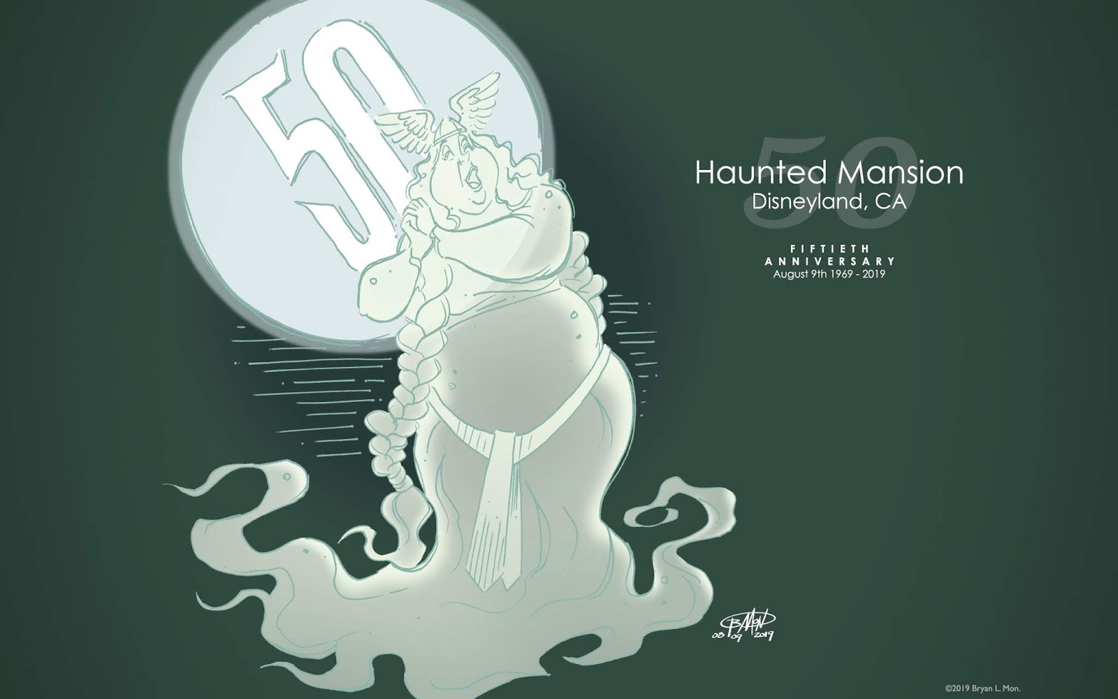
 Today, Disneyland’s famous spook house attraction, Haunted Mansion, celebrates the 50th anniversary of welcoming the public to visit its 999 happy haunts.

Pencil draft stage, carmine red pencil on paper.
21.6 cm x 27.9 cm (8.50 in. x 11.00 in.)
The attraction features a pair of opera singers, although I chose to only depict the female member. In the original vignette, conceived by Disney Imagineer Marc Davis, her male companion stands on her left side and is thin, wearing a stage costume version of nordic/viking armor. Her long, left braid is draped over her companion’s chest and over his far shoulder.

Ink stage, black ink and carmine red pencil on paper.
21.6 cm x 27.9 cm (8.50 in. x 11.00 in.)
The classic attraction has many vignettes and characters that are well-known even to casual Disney fans who have yet to make their first visits to a Disney Park. The trio of hitchhiking ghosts may be the most well-known. I choose for this anniversary tribute something a bit less well-known and then for simplicity to only depict half of the couple. To make her appear more ghostly, I drew her lower body transition to wispy, smoky trials. This is a departure from the look of the Mansion’s ghosts both from the audio-animatronic versions of the attraction and from the Marc Davis concepts.

Wednesday, July 17, 2019

Ev’rybody’s Got a Laughing Place

Today, the long flume ride, Splash Mountain, celebrates the 30th anniversary of premiering in Disneyland Park, California.


Inking stage.
Black ink and crimson red pencil on paper.
21.6 cm x 27.9 cm (8.50 in. x 11.00 in.)

Draft stage.
Crimson red pencil on paper.
21.6 cm x 27.9 cm (8.50 in. x 11.00 in.)

Fancy That

The Disney Channel Junior series, Fancy Nancy celebrated its first anniversary!


Black ink and crimson red pencil on paper.
21.6 cm x 27.9 cm (8.50 in. x 11.00 in.)

Saturday, June 1, 2019

Typhoon Lagoon at 30


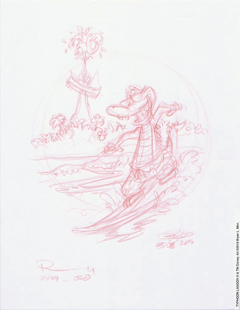
The Walt Disney World water park, Typhoon Lagoon, marks its 30th anniversary today.


Before a Google image search resulted in a scant few images of this red-orange alligator, I was only familiar with the blue-green mascot for Blizzard Beach. In saying so, I reveal that this is the first time that I’ve drawn the surfing reptile, and I’ll probably not have any reason in the future to drawn him again. At least not in the next 10 years before the 40th anniversary.

The differences in the sketch/ construction stage and the inked stage don’t reveal much beyond the shading decisions made on the inked stage. The hidden Mickey is a bit more pronounced in the sketch however.

The drawing was done nearly a full month before the digital coloring stage. Despite it not being a relatively long amount of passed time, it’s enough that I can’t recall if positioning the surfboard curving off the enveloping circle was intentional creating a sort of “9” shape. I think that I just pushed the surf-gator down and right to clear room for the park’s stranded boat icon. Intentional or not the result is that it connects the two, leading the eye from the surfboard counter-clockwise around the circle to the boat and “30” water spout.

Wednesday, December 24, 2014

Messy Clipsmas!


Happy new year, too!


I’ll be back in February 2015
with more newness right here 
at monotonae!