Pages

Showing posts with label 120 [m ]. Show all posts

Saturday, May 5, 2018

120 [m ] – Learn to Draw

Becoming a professional artist in visual media, is a largely self-taught endeavor or at least it requires a lot of practice. Still, a few tips can always benefit a student as she/he begins to formalize process, experiment with tools and techniques and pick up industry vocabulary and methods. Instruction and/or mentorship from a working artist is invaluable. However, a good book or two on the subject can offer a good start.

Here are three books that I can recommend to any one learning to draw, and certainly do as well or better than anything I have to offer on the subject.


How to Draw Comics the Marvel Way
Lee, Stan & Buscema, John. (1978) How to Draw Comics the Marvel Way, New York, NY, Fireside.
ISBN 0-671-53077-1
$11.98 (paperback, Amazon)

About the authors:
Stan Lee is the prolific and legendary writer who is responsible for co-creating most of Marvel Comic’s long-lived super-heroes including Spider-Man, The Fantastic Four, the X-Men and many more. John Buscema is the artistic powerhouse behind Silver Surfer, Conan the Barbarian and the Mighty Thor.

Book review:
The book’s twelve chapters covers nearly everything a budding artist of super heroics needs to know from the tools, through anatomy tips and page composition to inking. The black and white pages leave out discussions about coloring. The information is excellent for a solid foundation of drawing, even in today’s digital age.


Cartoon Animation
Blair, Preston. (1994) Cartoon Animation, Laguna Hills, CA, Walter Foster Publishing
ISBN 1-56010-084-2
$13.02 (paperback, Amazon)

About the author:
One of the fine artists of animation, Preston Blair designed and animated the hippos for Disney’s “Dance of the Hours” segment of Fantasia among other notable things. Blair would continue to direct and produce animation.

Book review:
With over 200 pages, Blair has assembled a comprehensive instructional for creating character animations. The first chapter, “Character Development,” contains tips an insights valuable to all artists not limited to animators.


100 Tuesday Tips
Grim and Norm. (2015) 100 Tuesday Tips
ISBN-13: 978-0-9908750-0-0
$55.00 (paperback, Amazon)

About the authors:
Normand Lemay and Griselda Sastrawinata-Lemay is a husband and wife team currently working as feature animation artists at the Walt Disney Animation Studio.

Book review:
Building on the foundations laid out by previous artists and authors on the subject, Griz and Norm distilled concepts into bite-sized lessons which they continue to share on social media, which is the origin of “Tuesday Tips.” Born of the current digital-age of art and media, they cover color theory, and add a few tips specific for a digital artist.


Sunday, May 1, 2016

120 [m ] - Original Art Watches at New Century Timepieces, Disneyland

“Basil vs. Ratigan” - The London tower clock face was a natural elements for a watch face.
From 1995 to 2000, I was a character artist drawing and painting original Disney character art in a shop on Disneyland’s Main Street.
“Little Hiawatha” - One of the first design I painted as a personalized order was purchased by a archer.
Davelandweb.com
There isn’t now much written about the program. There once was an article on one of the online fan sites either MousePlanet or MiceChat, but it seems that server updates and web site re-designs have eliminated it. That then makes my account here a kind of oral history of something of which I was a part twenty years ago. 
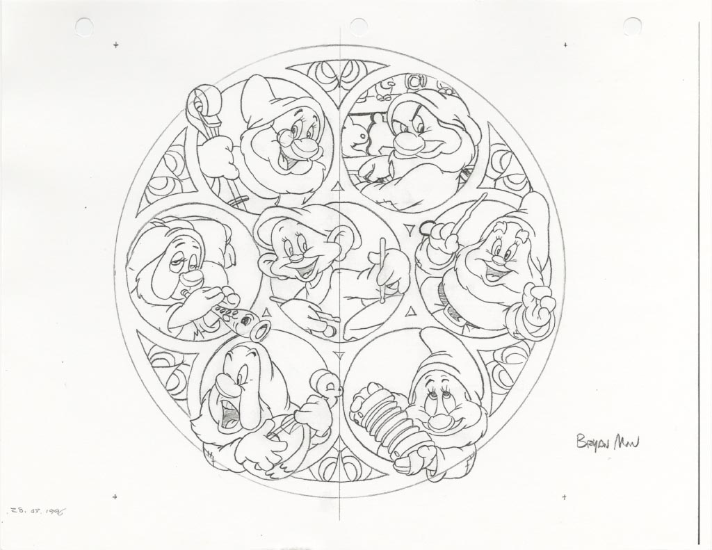
“Seven Dwarfs” - A lot of work. I would draw each in my shop portfolio as individual designs and removed the 7-character design.
The program was simple. Original art would be created and personalized for guests (a.k.a. customers) and reproductions of the art was then affixed to the faces of analog wrist watches.
“Jafar and Iago” - You can see how my designs were keeping important things like eyes away from the center peg for the hands.
The oral history passed to me has the mid 1990’s origin of this unique Park experience and souvenir/ keepsake with plussing (a.k.a. taking to the “next level”) the on-the-spot original character sketches done at special events. Typically at such events, Disney artists like Stacia Martin and Kevin Kidney, would sit in front of a painting easel, chat with guests and draw favorite Disney characters. The “plussing” part was the brilliant realization that reproducing art for a wrist watch could be done relatively quickly with a relatively portable color copier, computer and watch parts. Additionally, a gold-bezel wrist watchman can both be a keepsake and a fashion accessory. Consider that with similar at-the-time technology, how much more appealing a shiny wrist watch is over say a tee-shirt, beer stein or baseball cap.
“Darkwing Duck” - Quite popular at the time.
dapsmagic.com
micechat.com
davelandweb.com

The experience was popular and in 1994 (I think) it was brought to Disneyland and Walt Disney World. In Disneyland, they created space for an artist against the street-facing picture windows, just inside the doorway of the then named New Century Timepieces on Main Street, U.S.A. For their own reasons, neither Stacia nor Kevin stuck with the in-Park version for long. Certainly a contributing factor was that in the Park’s implementation, the program was assumed by the Park’s merchandise department, and all merchandise has its character art reviewed and approved (at least in rough pencil form) by an art director if not fully created by that department’s staff of artists. Artists sitting at an easel, “on stage,” so to speak, do not have art directors. 
“Mufasa and Simba” - Two characters drawn in different colors so that each could be used individually.
Now, in 1994, The Lion King premiered that summer, and hand drawn animation in a Feature-length film was at an all-time high in popularity. Failing to entice animators from the studios 40 miles away in Burbank to work even weekend shifts, Disneyland found talent in a short list of artists who did freelance work for Disney Publishing.
“Cheshire Cat” - The cat was pulled out of a limited edition design with 12 character groups encircling Alice representing her journey in the classic film. Here a touch of nonsense was substituting letter for a few of the numerals. They don’t spell anything.
In 1994, I had an Associate of Arts degree in Art received from Cypress Community College. I also was no longer working in Disneyland’s west side (New Orleans Square and Critter Country) restaurants department, I did, however, have friends and family who did still worked in the Park and not surprisingly, I found out about the Original Art Watch program on Main Street. To put myself in a position to apply for an artist position, I re-hired into the Park where I worked at Bengal Barbecue in Adventureland. As a strategic move, this was about as good as moving from Ohio to Hollywood to be an actor. Ultimately, based on the strength of my portfolio and the program wanting to expand for the coming summer, I and another artist were hired on. It’s possible my 6 year history with Disney in restaurants helped. The artists already on staff were Ken Edwards, Charles Landholm, Gerald Martinez, David Scott Smith, Todd Wiesenhutter, and Joe Yakovetic.
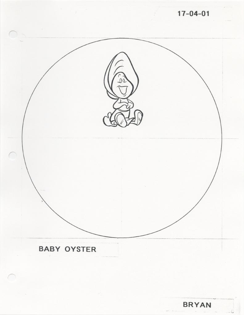
“Baby Oyster” - A minor character in “Alice in Wonderland” that I started to sneak into other designs.
In line with its origins with special events, the artist on Main Street drew and colored with art pencils. As a medium, color pencils are portable, cleaner than pastels and don’t require the drying time of wet media. Reviewing all of that in the portfolios in Timepieces, I was confident that I could handle that. What newly had been introduced coincidental but not related to my hiring was painting. I understand that water color painting was something Joe suggested to bring to the program which would plus the value of the art. A skilled painter can cover areas faster with paint than with color pencils. And mixing colors in paint allows more flexibility than with color pencil. Suddenly, I had to learn how to handle painting and do it on-stage with a time limit. I was less comfortable with painting. I chose to employ a manner of layering water colors to achieve what I wanted, a technique I used with harder, less waxy color pencils. I was never fast with paints.
“Pinocchio and Jiminy Cricket” - I painted this featuring a wooden clock face with Roman Numerals behind the characters.
In that first summer, the watch program tried out setting up a station in the then Disney Gallery in New Orleans Square for extra day shifts. I believe simple geometric logistics hurt this venture. The Timepieces location could accommodate up to four-times as many on lookers as being placed in a corner of one of the Gallery’s rooms. 
“Jiminy Cricket” - I never got to paint this for my shop portfolio, Jiminy pulled from off of Pinocchio’s hat. If there was something clever about the dial positions, I can’t remember or decipher it now.
The other new hire was Orlando De La Paz. As I remember things, Orlando parlayed the Watch program into getting freelance work as an artist with Disney Publishing. Having secured that relationship, Orlando recommended that I try the same. Entirely believing that it would not gain me better than a “thank you for applying,” I met with David Pacheco, Disney Publishing Art Director at the time. David had me work on a test pack. That lead to in-house freelance with Publishing. That lead to being hired on staff in 1996 as a character artist with Disney Consumer Products in Burbank. 
“The Three Caballeros” - indicating hat options.
By comparison, Orlando departed Timepieces that first summer. I kept up with weekend shifts for five years into 2000. In that time, there were a few additional artist hires, including Jonathon Peterson and Fritz Lutes. Ladies’ styled watches were tried, but the faces were too small to effectively show off the reproduced art. Pocket watches were tried, but weren’t poplar despite the larger faces. By virtue of not being employed directly by Disney, in the first couple of years the artists dressed in their own clothes. Later, they would don the same costumes as shop Cast-Members (a.k.a. employees). I also experienced the one-summer-and-done Light Magic “not a parade” street spectacle from behind a Main Street window! All Cast-Members wear name tags, and here I earned what is my third of four “one year” pins. To help you with the math, for four years I worked in Burbank during the week and in Anaheim in Disneyland on weekends. 
“Belle” - James Baxter’s design was one of my favorite to draw.
Possibly as a trickle down effect of the popularity of smart phones, New Century Timepieces became the Fortuosity Shop in 2008, that included a reduction in the selection of clocks and watches for sale. In 2012, the Artist Watch program ended at Disneyland with the five featured artists, Charles, Eric Scales, David, June Valentine-Rupee and Todd re-trained as cel painters and relocated to the new Disneyana (formerly the Disneyland Bank).
“Belle and the Beast” - Although approved, this never got entered into my shop portfolio. I drew the characters full for a possible limited-edition pieces, but I intended only for a waist-up shot for personalized orders.
The Original Art Watch program was a unique artist experience. There I was a Disney fan, drawing official Disney character art on which I could sign my name.


Data:

Program: Original Art Watches
Location: New Century Timepiece, Main Street, U.S.A., Disneyland Park, Disneyland Resort, Anaheim, CA
Program Start: 1994
Program Close: July 2012

Price, Monochromatic Artist Watch: $250
Price, Full-color Artist Watch: $500

Artist Watch package: 1x original personalized Disney character art, color pencil and/or gouache paint on hot pressed water color paper signed by the artist, 
1x artist’s auto biography, 
1x fully printed portfolio folder, 
1x men’s size wrist watch with leather strap, 
1x watch case.

disney-pal.com
Location succeeded by: Fortuosity Shop (Oct. 3, 2008 - present) (disney-pal.com)

davelandweb.com
Location Preceded by: Disneyana (1976 -1986), 
Hurricane Lamp Shop (1972 -1976), 
Upjohn Pharmacy (1955 -1970) (disneymamas.com)


Further reading:

“Artist Watch Program Ending”
@ DAPsMagic 

“It’s About ‘Time’ …”
by Michelle Harker
@ Disney Parks Blog

“New ‘Fab 5’ Ink & Paint Cels To Debut at Disneyland Park”
by Michelle Harker

mouseplanet.com

Saturday, May 16, 2015

120 [m ] - Season Three-tings

Here is the third of Cartoon Network’s complete season home video compilations. As I had done on the second, I provided necessary illustration and served as a sort of associate art director.

Following the character feature conceit with Finn for season one, and Ice King for two, with number three, we treated fans with favorite Beemo, a.k.a. B.M.O. Beemo’s characteristic rectangular face made him a natural fit for a DVD and Blu-ray case. Nickelodeon’s Spongebob works the same way.

For the design, we were fortunate that a few episodes by then had shown some of what Beemo’s innards looked like. Still the images of memory chips and hard drive discs we used for the disc art are rather boring, and probably why the internet doesn’t have fan pics of them. However, this led us to trying to re-think the printed contents insert page. Beemo conceptually doesn’t/ wouldn’t have a muscular structure reveal like that of what we did for season one and season two, certainly not one to be distinctive from the circuit board front and battery tray back we wanted on the case wrap. 

I then presented a proof-of-concept of the slip case with Beemo’s arms and legs attached. His arms and legs I had figured would fit on the top half of the printed insert, in fact I needed to make sure they’d fit, thus the proof-of-concept. I try to avoid the “would it be great if.., oh, that won’t work,” high-low scenario. With the proof-of-concept, art director, Candice and everyone pretty much said, “Yes, of course that’s what we should to do.” 

Now, I have no idea how many folks are willing to cut up their printed inserts to paste relatively flimsy arms and legs on to card board slip cases, but a few must have, and maybe the others got tickled by the thought that they hold a sort of kit to build Beemo.

And because I didn’t think that I could top “Build your own Beemo” for a DVD case, I left Cartoon Network.

Just kidding. That’s not why.

Adventure Time: The Complete Third Season
Art direction: Candice H.

All images found.

120 [m ] - Adventure Two Timer

With the no-surprise success of the first season DVD compilation, Cartoon Network had the no-surprise eagerness to follow it with the second season DVD compilation, also to be available on Blu-ray disc.

With this and the Ben 10 Ultimate Alien DVD’s I became involved with DVD packaging and menu production to a deeper level than the illustrations I had contributed with most previous projects be it DVDs, posters and all sorts of marketing and advertising materials.

By golly, DVDs can require a load of bits and pieces all needing design work:
1) the cover art;
2) maybe a slipcase;
3) maybe a two-sided printed insert;
4) the disc(s);
5) maybe a sticker calling out features;
6) and every menu screen.

Then you repeat all of that for the Blu-ray version which has a smaller case, but bigger, higher resolution menus. I had kind of forgotten that since my days in art school. You know, where an assignment might be to conceive and design all of that by yourself.

With the idea of using Jake (the dog) as all-over packaging used on a different DVD compilation, Candice opted to use the villainous Ice King for Season 2. The layers of reveals motif was applied again. Removal of the skip case reveals Simon, the Ice King’s shaven “normal” pre-Ice King appearance.

Then again like for “One” there is muscle structure King for the contents insert page, his skull for one disc, and brain for the other which has been encased in ice for that bit of distinctiveness.

I did the bulk of the illustration work necessary. I also up took additional responsibilities of intermediary between Candice and hired designer who did the so-called grunt work.

In this new operational structure, I constructed sample of the slipcase as a “proof of concept” to test its structural integrity. This was greeted with pleasure and unexpected surprise. Folks weren’t making proof-of-concept prototypes. As it had seemed to me, people were doing less of that kind of exploration and trying to jump projects from thumbnails to finished layouts. Maybe its lack of time. Maybe it’s “the process” and there are parts which can’t reliably be planned for its time and expense. Well, I like to have things planned, so that’s something I brought to these projects.

Adventure Time: The Complete Second Season
Art direction: Candice H.

All images found.

120 [m ] - One Upon an Adventure Time

I had worked on a number of Cartoon Network’s DVD packages up until I parted ways for other things. I’ve mentioned a few times, I’ve worked on the arguably repetitious Ben 10 DVD package designs, extending from the original series through it’s Ultimate Alien installments. I also worked on the first three “Complete Season” compilations for Adventure Time.

With the first season, the conception owes to Candice ’s art direction. As a simplified telling of it’s evolution, as the first and expectedly popular (should sell a lot of ’em) DVD compilation, it was thought that it should be special. “Let’s give it a slip case.” “Let’s leverage lead character Finn’s iconic hat silhouette.” “Yeah! THAT’s the slip case! You remove that slip case to reveal... uh, hat-less Finn and his luscious, blond hair!” Then everything else with the printed insert and disc art played on deeper revelations.

As the illustrator, I came up with muscle-structure (skinless) Finn, and Finn’s skull and finally Finn’s brain.

I’d say that my most important creative contribution was to assuage fears of showing Finn’s blonde hair between the slip cover’s die-cut hat ears. It was a small discussion, to be sure, but seeing what’s Finn’s hair outside his hat make no logical sense. However, as an area of flat yellow, it takes on a different function as that of non-character field color.

Adventure Time: The Complete First Season
Art direction: Candice H.

All images found.

Thursday, May 7, 2015

120 [m ] - Things You Macy*s Above New York Thanksgiving Morning

One of the truly big projects I had a hand in which I worked, during what turned out to be my last year at Cartoon Network as a Senior Character Art Manager, was designing the Finn and Jake balloon for the Macy*s Thanksgiving Day parade.

For the parade, Macy*s selects properties and characters with “staying power” to license for their floats and balloons. Macy*s has a division devoted to the design and construction and care of the floats and balloons.

For show, “Adventure Time with Finn and Jake,” the balloon could have been Finn (the human boy), or Jake (the dog) or some how be both characters. The Macy*s folks had ideas, and we at Cartoon (Jake, Candice and me) had ideas. With the concept of Finn riding on the back of Jake selected, I then  iterated multiple versions of what that combination might be. Thankfully, Jake is a shape and size changer, so we stretched his typically stout body making him large enough to carry Finn. I drew the balloon in a couple of key views from which the sculptor could work.


Macy*s’ sculptor created a clay maquette about 24-inches long. On may sole work trip to the Macy*s shop, I gave my typical creative notes, “Make this bigger, move that there, etc.” and since the maquette was as big as it was, I got hands on and reworked parts of it while the sculptor worked on another part. Above is an image I found on the internet of the final painted version. Sharp-eyed folks might have caught sight of a snail that caught a ride with in Finn’s back pack.


The final one-of-a-kind balloon is comprised of many panels, whose measurements and positions are translated from the approved maquette. The process is slightly more complex version of the dress maker’s art. In the above image, also found on the internet, you may suss out what an art from it is to start with something that’s 24-inches long and recreate it as an inflated fabric shell nearly half the length of a American football field.

Monday, May 27, 2013

120 [m ] - Hatter Late Than Never

“Party”
India ink on Bristol Board
35.6 cm  x  27.9 in. (14.0 in  x  11.0 in.)
2011

For the last four Springs, I have been involved with the Mad Hatter event put on by the Young Audiences, Woodruff Arts Center at the High Museum in Atlanta, GA where I volunteer conduct “how to draw” sessions. The characters I demonstrate are characters from Lewis Carroll’s Wonderland books.

For an auction they had, I drew the above inspired by the illustrations by John Tenniel.

Wednesday, May 22, 2013

120 [m ] - Back and Force

 Conceptual compositions for promotional posters for the launch of Ben 10 Alien Force.
2008.

 Conceptual compositions for promotional posters for consumer print advertisments of Ben 10 Alien Force.
2008.

Conceptual compositions for promotional “tease” posters for the launch of Ben 10 Alien Force.
2008.

Back in 2008, Cartoon Network had in production Ben 10 Alien Force, a spin-off series of its successful Ben 10 animated actioner. In it, Ben was five years older, and teamed up with his cousin, Gwen and former adversary Kevin Levin. In true sequel fashion, so much of it borrowed from its predecessor: a) a basic logo design; b) “kid with a magic watch” set up; c) alien heroes; and d) green.

Thematically, the series was darker and even took place mostly at night. However, the key impression we attempted to communicated was “different” while retaining all the audience’s favortie parts.

Series producer, Glen Murakami, offered some suggestions for poster images in the form of his inspirations for the new series. And then I drew. As an experiment, I tried sketching natively in Photoshop with the Wacom Cintiq digitzing display. A practice helpful when I was experimenting with  resizing and re-positioning elements like logos and iconic images of Ben.

The teaser poster, resembled one of the concept sketches - well, if not for any other reason than we locked the shadowed Ben pose at the start, because it was a pose already being produced for licensing. The consumer print ad turned out pretty faithful to the layout of the first sample on the left of the second row.

I’ll note additionally, that I always seem to throw in tilted layout options for action show posters, and some where in produciton someone straightens them out.


> sigh <
BEN 10 ALIEN FORCE TM and © Cartoon Network.

Tuesday, May 1, 2012

120 [m ] : Disneyland

 Disneyland is a remarkable place. 

 Literally people talk about it, write books and blogs about it, read the things that people write about it, while others reference it regardless of whether or not having passed through its gates. I’m talking about Disneyland - the original built amongst oranges groves in Anaheim, California, USA, whose gates opened to the public July 17, 1955 - the most remarkable of the Disney parks dotting the globe and without question remarkable beyond comparison to other theme parks.

Right off the bat, on these topics:
• History: Disneyland is the first.
• Licensing: Characters live beyond theatrical runs.
• Marketing: It’s an actual place where you can spend time with the characters.
• Amusement parks: It reset the standards of quality, service and cleanliness.
• Experience: it’s new, nostalgic, fun, thrilling, scary, spectacular, lyrical and tasty. It is noisy, crowded and expensive, and yet still nets to being magic.

I say that its remarkable-ness is inextricable from Walt Disney and his paraphrased notion that there just should be a place like it.

It’s remarkable that a park of popcorn and carrousels expanded to the complex with different themed lands that Walt and Herb Ryman created over a September weekend in 1953 as a pitch to investors. It’s quite a thing to go from the height of controlled story-telling that is animation, to re-inventing an entertainment form which both envelops its audience and relies on the audience’s interaction.

It’s remarkable in that even with all his business and personal finances put into it, Walt needed investors, and he got them at a time when amusement parks were thought of as a dirty source of entertainment.

It’s something in the fact that after one year and one week Disneyland was constructed amongst farms off an exit from a new highway. Hoover Dam took five years to build, the St. Louis Arch required over two years and Walt Disney World with its first park took four years.

It’s remarkable that people argue which is better, Disneyland or Walt Disney World - an inaccurate comparison of a single 85 acre park to a 30,000 acre resort which should be a feeble contest when WDW began as a project for Walt to improve upon the faults and shortcomings of the original. (Disneyland IS better with 80 attractions compared to WDW, Magic Kingdom’s 46).

It’s remarkable in that after 55 years and 45 after Walt’s death, the folks inheriting the custodianship of Disneyland have neither screwed it up by allowing it to become worn and outdated, nor ruined it by “improving” it beyond recognition. Having been away from that custodian status (three runs, about 11 non-consecutive years) for over a decade, I still care for what goes on within it’s berm. It’s gets in you and stays with you, host and guest alike.

With all the bad things about people, you’d think that a thing like Disneyland should not exist or last, but still it just kind of should. That’s kind of remarkable.


“[The idea for Disneyland] came about when my two daughters were very young and Saturday was always Daddy’s day with the two daughters. So we’d start out and try to go someplace, you know, different things, and I’d take them to the merry-go-round and took them different places and as I’d sit while they rode the merry-go-round and did all these things--sit on a bench, you know, eating peanuts--

“I felt that there should be something built where the parents and the children could have fun together. So that's how Disneyland started.

“Well, it took many years... it was a period of maybe 15 years developing. I started with many ideas, threw them away, started all over again. And eventually it evolved into what you see today at Disneyland. But it all started from a daddy with two daughters wondering where he could take them where he could have a little fun with them, too.”


 — Walt Disney


Sunday, April 29, 2012

120 [m ] : Ben 10: Ultimate Alien Launch Billboard

2010 - Another Ben 10 series, another launch campaign. This time Ben goes ultimate, or more precisely, some of Ben’s alien hero transformations from the previous series, Alien Force, go ultimate.

At the conceptual stage, I think Matt, Clint and I pitched some of the more diverse selection of visuals since the original series (above). This is probably because we were consciously avoiding any thing that looked like a Ben 10 poster or DVD package used by Cartoon Network (CN) prior to this point.


And the winning design to advance to the rough layout stage - features heroic Ben, popular alien, Humungousaur, and new variant alien, Ultimate Humungousaur (above). Stated like that, it sounds like we just fulfilled a marketing wish list.

The final digital painting was done out of house by artist Phillip Hom, under my art direction.


Presented here (above) is the “final” version of the poster - straightened out, cropped wider and green cosmic flames added around the figures. In animation, the green flames expand out from the chest Omnitrix badge on Humungousaur in Bonanza fashion to reveal his ultimate incarnation. Without animation, you wouldn’t know what it has to do with the show or its characters. The lesson here is, “hey, you artist working for a company, this is not your art.” The final poster was displayed outside the Atlanta Turner buildings facing 10th Street, had limited internal CN distribution as a poster, and served as the visual basis for all launch materials including on-air and on-line.

Saturday, April 28, 2012

120 [m ] : Star Wars Clone Wars Billboard

2009 - I forget if these were part of a sustaining campaign for the series (as in “currently on Cartoon Network”) or for the series’ second season. I do know that we were going to rely on existing imagery and not explore any thing requiring special new rendered poses of the Star Wars characters. These are my explorations, and resemble nothing of the final billboard.


The billboard, as a note, was a single billboard on Sunset Boulevard in Hollywood, CA. It was not part of a big national campaign. The hope was to create an image so “cool” that it would go viral on the internet.

120 [m ] : Ben 10, Alien Swarm Central Image

2009 - Alien Swarm, as mentioned previously, was an original live action movie featuring the main trio of characters, Ben, Gwen and Kevin, from the Cartoon Network (CN) animated series Ben 10: Alien Force. Especially because it was a movie, although CN does tend to pattern big marketing campaigns as movie premieres, we were to develop a movie poster to deliver all the iconic elements of the program. This was quickly, albeit informally, known as the central image.


The creative team of Matt, Clint and myself (if memory serves) largely were inspired by the current tropes of an action movie movie poster: 1) ample use of black; 2) saturated key colors (green for all Ben 10 iterations); 3) big faces of the main actor*; and 4) vignettes of key action sequences, villains or mystery characters**. Above are the little conceptual thumbnail drawings I produced on our initial brainstorming session, which mostly served as a guide for poses and camera angles which could possibly be of use from a photo-shoot of the four young actors.

Here’s what I feel needs clarification:
* Big faces of the main actor/actress is only of value if the target audience is expected to recognize the actor/actress. That seems like basic marketing to me. Alien Swarm cast all young unknowns for the main cast. But big faces being so much a part of “action movie” poster vocabulary, it was hard not to deliver some as conceptual explorations.
** Mystery characters- to show them or not to show them? Elena, the mystery character in “Alien Swarm” had nothing to offer as a visual element to the poster, because she was not part of “Ben 10” mythology. She was only given a back story to connect her to Ben - so once after audience figures out who the other three teens are they are left to wonder if the second girl is maybe Ben’s girl friend, Julie, with re-cast ethnicity. Mostly, the mystery of Elena is whether or not she is on Ben’s side, and that kind of ambiguity does not read well in a poster visual.

As always with Ben, it’s his wristwatch, the Omnitrix, that gives him the power to jump into action. It isn’t Ben that punches and shoots things, it’s any number of alien heroes in which he’s transformed that punches and shoots things.

There was the additional complication that the visual effects company would not be able to fulfill any special request for images of Ben’s alien hero transformations.

Wednesday, April 25, 2012

120 [m ] : Ben 10: Alien Swarm for Action Pack

2009 - Ben 10 continues to be successful and Cartoon Network (CN) creates the franchise’s second live action movie, Ben 10: Alien Swarm. In it Elena is introduced as 15 year old Ben’s friend from his childhood (no she not a character that appeared in the original series). DC Comics’s CN tie-in comic magazine Action Pack was to include a story with the “untold” story of how Ben first met Elena.

Elena, 10 yr., with expressions.

 
Elena and Ben, compositions.

I don’t know how such things come to be, but our group of Atlanta based illustrators was approached to design Elena for the comic, even though we would not do the actual comic illustrations.

 Elena, 15 yr.