Pages

Monday, March 26, 2012

WonderCon 2012, Books, pt. 1

Tales from Small Press and Artist Alley

“Boilerplate: History’s Mechanical Marvel”, 2009
by Paul Guinan and Anina Bennett [review]

“everyday love: the art of nidhi chanani”, 2011
by Nidhi Chanani [review]

“The Games We Play”, 2011
by Meredith McClaren [review]

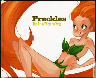
“Freckles: The art of Victoria Ying”, 2011
by Victoria Ying [review]

Sunday, March 11, 2012

WonderCon - Anaheim, 2012


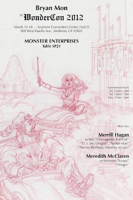
Manic Kingdom

Tight pencil. 
Carmine red pencil and Black Prisma Color pencil on Bristol Board.
2012.

Final cropped color. 
Digital color over cleaned scan of tight pencil.
2012.

I’ve had this image, or versions of it, waiting in the back of my head to be realized, pretty much since the inception of Tuff-Girl when I was drawing Las Vegas centric story ideas. Vegas has her iconic wide diamond shaped sign. She also has the casinos’ neon signs of the strip. And of course, there’s “Vegas Vic” and “Vegas Vicky” (a.k.a. “Sassy Sally”).

I wanted to explore more icons of the south west. For me, there’s nothing in California circa 1970 more iconic than the old marquee of the Magic Kingdom - right up there neck-and neck with the ubiquitous“Hollywood” sign.

This is also one of those images where I am just dying to figure out what the story behind it is.

For the first time, I attempted to keep the pencil lines, with out outlining everything. As such I probably spent twice as much time on the coloring stage as necessary. The grain is especially lost as it’s reduced and saved as JPGs.

Meredith McClaren

December of last year, Meredith was named one of the 13Fantastic (New) Female Comic Creators of 2011 on Kelly (3 Chicks Review Comics) Thompson’s blog about comics and things.

Meredith, 2008a, * * * * -

When she was an intern with our illustration group, I drew this caricature as I had intended to do of all the folks I worked with.

Meredith, 2008b, * * * * -

Then I drew this alternate version, having not been wholly satisfied with the previous - and I don’t know why exactly. Was it the third position ballet pose? Was it that the ice cream and her ponytail need more puffiness, more life?

[Meredith, 2008, * * * * -]

[Meredith, 2009, * * * - -]

Visit her blog, “IniquitousFish”:

Read her weekly comic strip, “Scraps”

Read her illustrated story “Hinges” with new pages posted Fridays:

See more of her art:

Margeaux McClelland

Margeaux is a young artist trying to make her way in the world as a freelance illustrator and comic artist.
Margeaux, 2007, * * * * -
 
When she was an intern with our illustration group, I drew this caricature of her to post of her shingle a.k.a. cube number sign. At the time, I had a personal goal to caricature all the folks I worked with. The most iconic part of this drawing, the Mary Marvel inspired shirt, was something I made up. If I was to even to make her shirt more fitting with what I knew at the time about her personality and affinities, I should have at least done some thing “Dragonball Z” themed.

Also, I now think I missed the mark with the faded earthy colors, and rather should have used bright colors.

 [Margeaux, 2009, * * * - -] 

Visit Margeuax’s blog (a.k.a. “Margeuax’s Art Dump): 

See more of her art:

Thursday, March 8, 2012

MegaCon - Stuff and Boothery


One could look at having booth space at a convention, at least a comic & sci-fi convention, as setting up a mini store for three days. So what’s your business? What are you selling? Who’s your competition? How do you attract customers? Do you accept major credit cards? How much for that yellow board with the painted-on smiling face?

All I really want to do is draw pictures and tell stories. Ugh, business busy-ness.

On the attracting customers point, because it’s one of the last things within your control, and yet often the potential customer’s FIRST impression, the answer is simply advertising - or marketing really. The booth space it’s about having presence. I’d advise three things:

1) Something Big. Something to catch as many wandering eyes as possible. If someone 2 aisles down thinks “what is that?”, wouldn’t you like “that” to be your booth?

2) Color. People like color. Give the people what they like. Isn’t that why you have booth space at a comic convention, even if the “people” are are a small, rag-tag, rebel band of fugitives?

3) Lots of Stuff. This simply means lots of sales opportunity, but also lots to look at and more reason and time for the customer to linger. Some times lots of different book titles just looks like lots of books, so throw in different sized books or prints or just different type of merchandise.

I don’t advise free things, unless you can justify it in your marketing budget. Giving stuff away is just negative income is not the same as advertising.